Friday, June 29, 2012

Shiny birds

One more bird post.  It turned out that birds with shiny objects were a popular interpretation of the Illustration Friday topic "Shiny."  I thought it would be interesting to present a selection, showing what a range of styles you'll see from the artists who submit there.  Be sure to visit all of their blogs/websites to see more of their wonderful work.

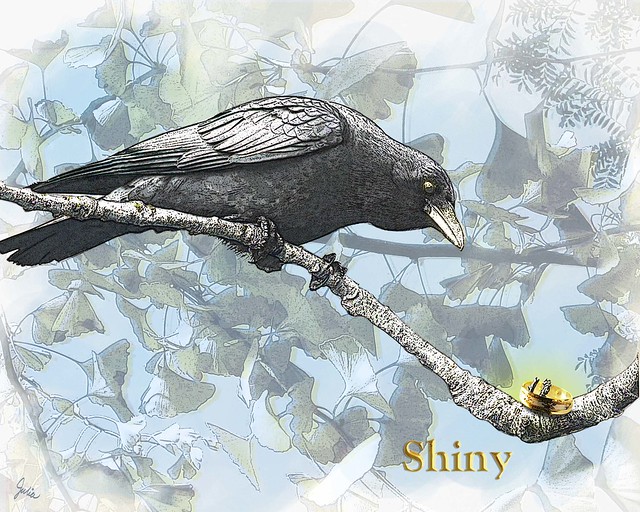
The first is from professional  illustrator Mikela Prevost.  About her process, she says "I do a sketch on stretched watercolor, then do a tracing of the sketch on tracing paper that will later serve as my "pattern" later for cutting out clothes or other objects that require collage. I then do the tight nitty-gritty watercolor work and then reward myself with acrylic and gouache messiness to round out the rest of the background. The collage is then applied and then for kicks and giggles, I go back with acrylic or gouache to mussy-up the whole thing."

The next is by Elizabeth Rose Stanton, another professional who specializes in children's book writing and illustration,  listing her skills as "pen & ink, graphite, watercolor, pastel, some computer stuff."


Here is a very different take in acrylic and graphite on watercolor paper from illustrator Rachel Fuji who "hope[s]  my artwork creates dreamlike, fleeting atmospheres filled with soft, intricate details that allow the viewer time for quiet reflection."

Amanda Dilworth is a freelance illustrator and surface pattern designer in England.

And here is Cyndi Tanner's submission.  She's a recent graduate with a degree in illustration who works "mainly in mixed medium, goauche, ink, dyes, graphite; enhanced digitally. I also am in love with textures and love to experiment with them."

Stephen Macguignon, a children's book illustrator, says "I interpret the words written on a page by telling the story behind the story working with pen and ink and then digitally coloring."


Friday, June 22, 2012

Charley Harper

Now here's an artist who knew how to illustrate birds.


It was probably a couple of years ago that I first spied a Charley Harper calendar in a Paper Source store and immediately wanted to see more of those striking, stylized images as well as find out about the man who made them. There's certainly a lot of info on the web about Charley Harper, but I especially like this site, Charley Harper Prints.

He was of the generation that came of age around the time of WWII, and after his stint in the military, he graduated from the Cincinnati Art Academy in 1947.  Searching for a illustration style that would set him apart, he eventually developed a flattened, simplified approach which he called "minimal realism" and applied notably to nature subjects. It was a style also especially suited to serigraphy, aka silk-screen printing, which he embraced enthusiastically.  Be sure to read his own genial account of his artistic development and career.

One of the things I found most interesting was his work for Ford Times magazine. According to various Internet sources it was first an employee publication and later a general interest magazine.  The Charley Harper Prints website says it was sent by Ford dealers to their patrons.  My parents were Buick drivers, so I'd never heard of it; have you?  From 1948 to 1982, Charley Harper contributed illustrations to Ford Times, and it was through this publication that he became acclaimed for his renditions of birds, hand-screened prints of which were even made available to readers.

To me, whatever the date, his is quintessentially art of the 50s, and as part of the generation that fell in love with the whirls and curls of Art Nouveau in the late 60s, it took me a while to fully appreciate this particular aesthetic.  But who couldn't look at his brilliant reductions that capture so well the minimal telling details and not be impressed?  His artwork is graphic, colorful, and decorative, with subjects – birds, bugs, fish, forest creatures – that are easy to love.


Today's aesthetic sensibility seems to be attuned to his work; locally I've seen prints by at least a couple of artists who have obviously been inspired by him. It seems that designer Todd Oldham as creative director of Old Navy is probably responsible for introducing Charley Harper to today's shoppers; in a video that's definitely worth watching he talks about discovering a Ford Times magazine in a thrift store and his subsequent captivation with Charley Harper's art. Whatever may be the case, I'm certainly grateful to have been introduced to this artist with his unique vision. Not only is his artwork a delight to look it, it also helps one's own eye to see with a different perspective.

Thursday, June 14, 2012

Illustration Friday - Shiny

Shiny

A crow  peering at a shiny object seemed a natural for this week's Illustration Friday topic.  I'm quite fond of crows, having had one as a pet when I was a wee girl back in Indiana.  For the crow, I searched for Creative Commons images on Flickr.  Wow, are there a lot of photos of crows!  I'm always interested in how something is created, so I thought I'd show you the raw material, i.e. the photos, that went into this composition and explain what I did.  Here is the crow photo I chose from Sean McCann's Photostream.

Crow First I extracted the crow and the major branch he's sitting on from the photo, then cloned out some of the small branches that overlapped the crow and the major branch.  Next I filtered one copy of the crow, using Poster Edges and Film Grain filters, set to Hard Light blend mode.  Using a technique from this Photoshop tutorial, I ran another copy through the Find Edges filter, then copied and filtered that copy twice again, the first and second set to Overlay blend mode, the third to Lighten.  There's a Hue/Saturation adjustment layer clipped to the crow, to bring the saturation down and and remove the warm brown tone of the original photo.


 After I was satisfied with the crow, I searched for a ring photo from Stock.xchng .  I cut the top ring out of this photo, ran the Find Edges filter on two copies, one set to Multiply at  50% opacity, the next to Color Burn at 100% opacity, both over the top of the ring photo.  And, of course, all three layers have a mask so the ring is "caught" on the little stubs of the tree branch.

There's a blue "watercolor" background done in Painter, and then over that is my photo of ginko leaves, also filtered with Poster Edges and Film Grain. There's one copy set to Color Burn at 17% over a second copy set to Luminosity at 40%; both copies have masks that correspond to the blue watercolor layer.
Finally I put a yellow gradiant glow on a separate layer – Color blend mode, 68% opacity – above the ring to focus attention on it. Underneath it all is a solid white layer.  The title Shiny was done using the instructions for metallic type in an old Photoshop book on type effects.

Okay, if anyone who doesn't do Photoshop read all that, I'm sure you're yawning by now.

Sunday, June 10, 2012

Jockeys & Java


Back when I was a horse-crazy kid I would have been ecstatic getting to go to an event like Jockeys & Java at Lone Star Park.  Grown-up me still had a great time, as did Mr. C.  It was civilized, it was pleasant, it was fun.  And did I mention it was free?  First, we enjoyed a buffet breakfast on the shaded Courtyard of Champions while watching the horses exercising out on the track.


Naturally, as soon as I had downed my last bite of Danish, I skipped down to the rail to see the action up close.  Some of the horses came cantering by, others were galloping flat-out, often in pairs, hooves hammering the track, tails flying out behind.


Closer to the rail they ambled by in the opposite direction.  Here's a photo I especially like, looks like the thoroughbred is getting a big hug. 


Next, track announcer John Lies came out with jockey Weldon Cloninger who gave us an inside look at a life riding race horses. And then track superintendent George McDermott gave us the dirt, so to speak, about racing surfaces, their maintenance and the attention that goes into making them usable and safe for each day's races, all very interesting.


Finally, the best part was when we were bused down to the stable area where we were allowed to admire and pet the thoroughbreds in one of the barns. 


Wonder what they were thinking about all these strangers who suddenly descended upon them with outstretched hands and clicking cameras.

Kudos to Lone Star Park and their courteous staff for treating us to such a delightful experience; I hope it earns them some new racing fans.  We're certainly going to be back very soon to watch these beauties run for real.   

Wednesday, June 6, 2012

Are you curious?

Curious about art? About science? Nature? Places and people? About all sorts of things?  Then you'll want to take a daily look at Kuriositas, the website of R.J. Evans who "write[s] about the stuff [he] think[s] is worth pointing out to others and saying hey, look at that." Some of the many things he's pointed out in the brief time since I discovered the site are:

A Magical Mermaid Miscellany (mermaid statues from around the world),


 and The Story of Symbols (that's the asterisk).
Some are amusing, some are serious, some are thought-provoking; all are informative in one way or another. I only regret that I have so recently come upon it, but the upside of that is the two and a half years of archives awaiting any moment when I might feel a hint of boredom coming on. 

Friday, June 1, 2012

Taking the trolley

How appropriate that we chose to take the McKinney Avenue trolley to see the "Lost Dallas" exhibition at the Dallas Center for Architecture.  And what a glorious day for it we had, all sunshine and balmy breezes after three days of rain that lowered temps to near April levels.

Petunia arriving


"Forward-looking" Dallas removed its streetcars in 1956, and it was not until 1989 that they returned, operated by a non-profit organization, the McKinney Avenue Transit Authority. They now run from the West Village through Uptown to downtown by the Dallas Museum of Art, around two miles, and are in the process of expanding.
 
Inside Petunia


Matilda arriving
  At the West Village, we boarded Petunia, a 1920 "Birney Safety Car" that plied the streets of Dallas until 1947 when she settled as a residence for 30 years before being restored to glory.  A mom and her excited kids, a nicely-dressed older couple, and a few other people were our fellow passengers on this ride which took us nearly to the end of the line on the edge of downtown. 

Returning from the exhibit, we caught Matilda heading back.  She's a 1925 car who served six decades in Melbourne, Australia and is now the largest in MATA's fleet.  Lots more people on board now: kids and parents just having a ride for the fun of it, workers heading to lunch.  We hopped off for lunch at a shaded patio that was bustling on this perfect-for-alfresco-dining day.
 
After lunch it was Petunia again who arrived to take us back to the West Village.  As an extra special treat, we got to revolve around on the Uptown Station turntable which delighted all the kids. So ended our first excursion on the McKinney Avenue trolley, but it won't be our last.

 
Petunia on the turntable