Showing posts with label Illustration Friday. Show all posts

Wednesday, April 4, 2018

Illustration Friday - Mushroom

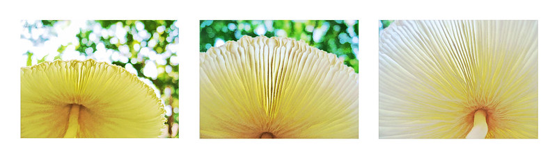
For a number of reasons it's been nearly a year since I've participated in Illustration Friday. I usually do glance at the topic, and for this week's Mushroom, I had just the pics I wanted to work on. Here's what this mushroom looks like from a normal perspective. On the internet I discovered that it is Leucocoprinus birnbaumii, common in potted plants and greenhouses, but this was growing in a neighbor's flower border. I thought it was lovely and snapped several pics of it, including these from underneath which have received the usual intensive Photoshop treatment here. 


Mushroom triptych

Wednesday, May 31, 2017

Illustration Friday - Mind


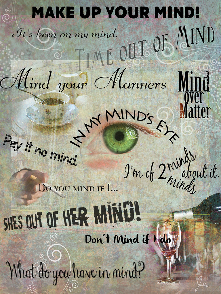
At first I had a difficult time putting my mind to this topic, but it was the last Illustration Friday of May, and my goal is to do one per month. Of course, as I probably have mentioned before, there are no IF police minding how well the submissions correlate to the topic, but trying to actually illustrate the topic is part of the challenge to me. In the course of seeking inspiration, these various idioms and expressions crossed my mind, and I thought I'd just have fun with them. The photos are from Morguefile; the textures from a Creative Commons search on Flickr.


Thursday, March 30, 2017

Illustration Friday - Umbrella


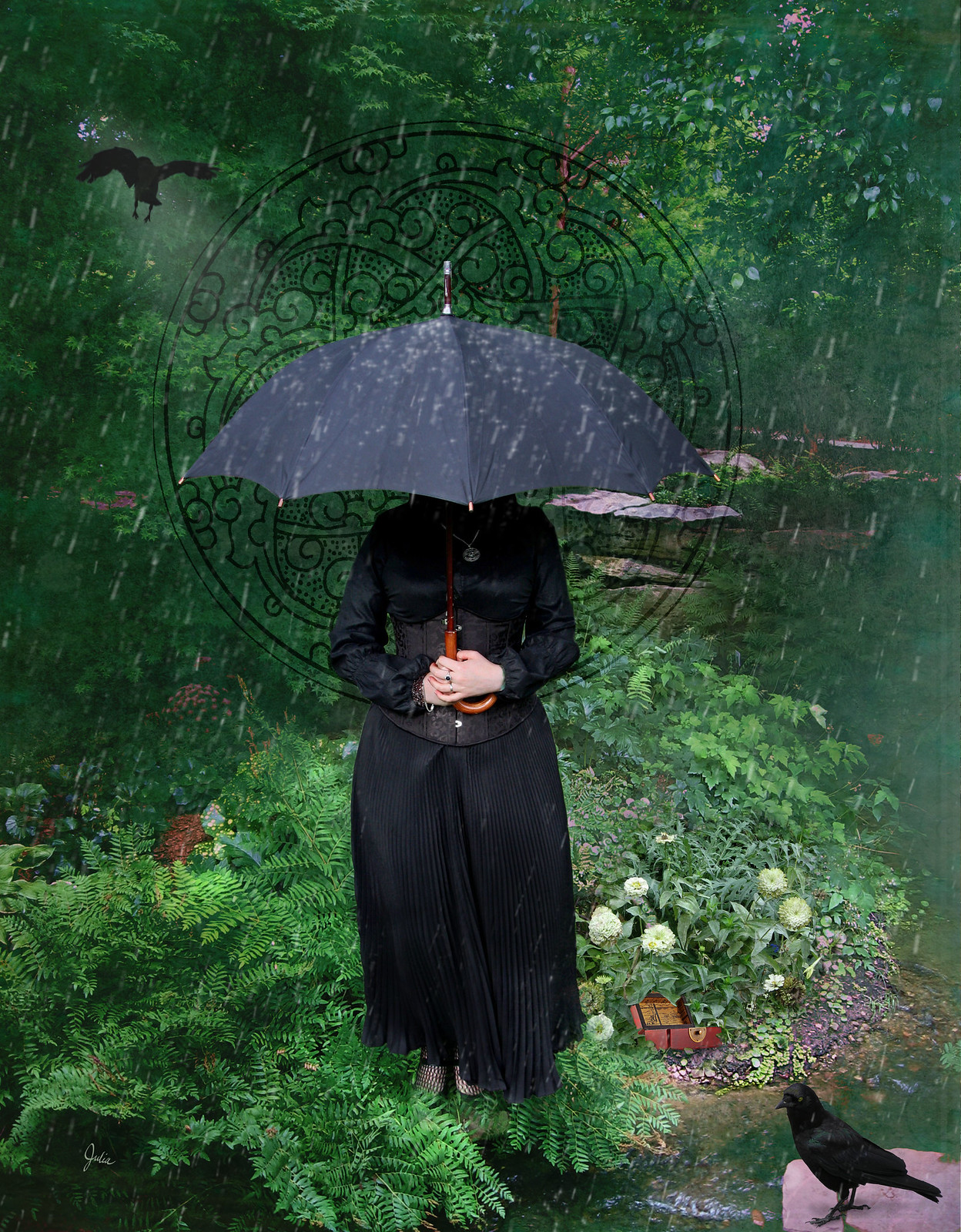
Definitely a more-is-more composition, but each empty space seemed to call out for another element.  I began with the beautiful central figure by Aeria-Model on DeviantArt and used one of my own photos as the setting.  The crow on the rock in the right hand corner is from Morguefile, as is the flying crow in the upper left hand side. The open box under the flower is from stockvault. There are also two different textures, one from Flypaper Textures Taster Pack and one from flickr which I can't attribute.  The decorative circle is from Dover Photoshop Brushes & Creative Tools: Calligraphic & Abstract Designs.  And, of course, what's the point of an umbrella without rain?  Created here with rain brushes from DeviantArt.  With the exception of the Dover book, all of these resources were free, so thank you to the individuals who generously offer their work for the use of others.
Photoshop Brushes & Creative Tools: Calligraphic and Abstract Designs - See more at: http://store.doverpublications.com/0486991016.html#sthash.LvXFneUV.dpuf

Monday, February 27, 2017

Illustration Friday - Spin

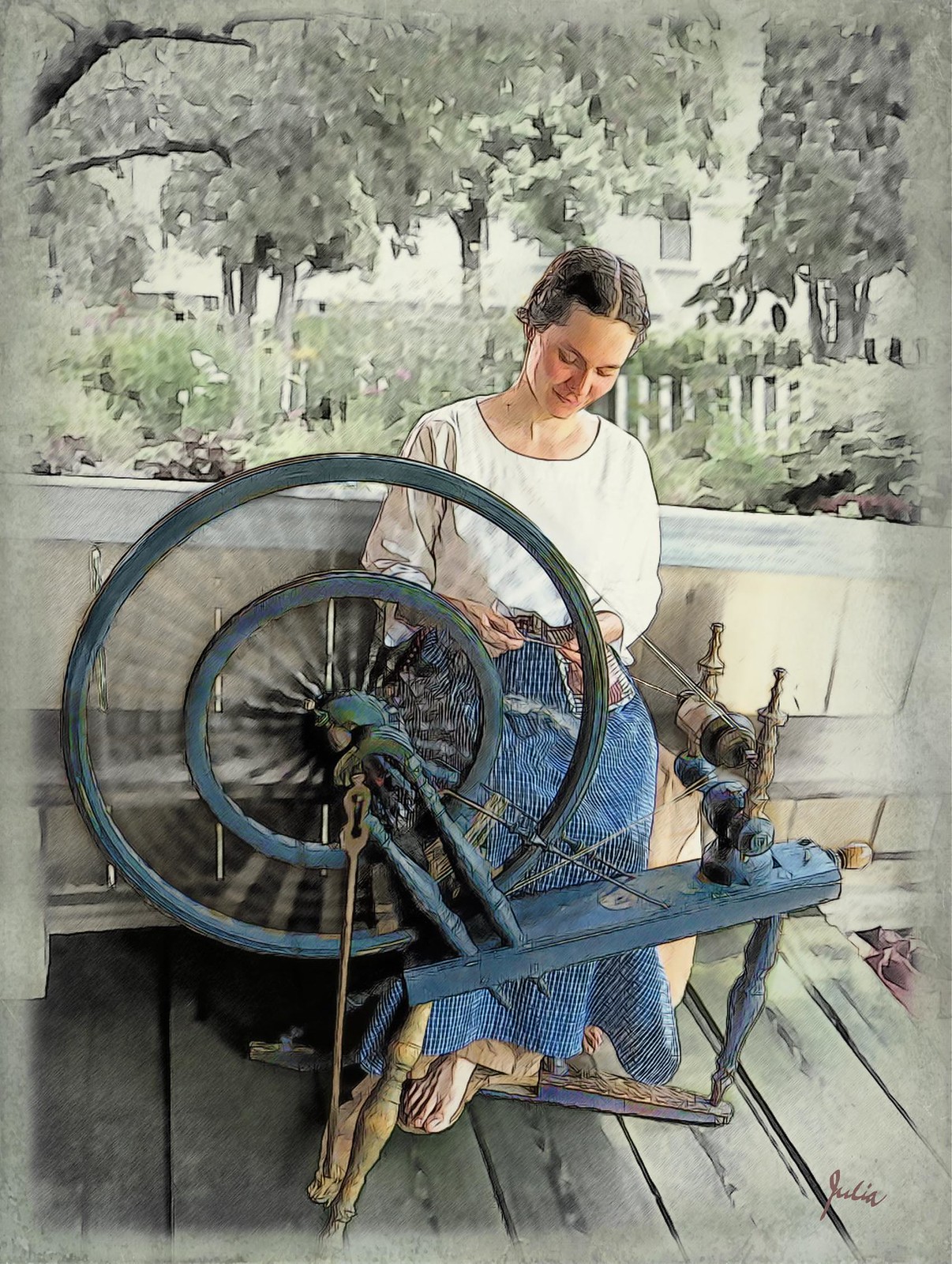
Not the current topic but one from last year that I never finished. Since none of February's topics inspired me, I decided to have another go at this one. I'm sure that the original image came from a Creative Commons search of Flickr, but, unfortunately, I can no longer attribute it. The spinner is wearing an ID tag at her waist (which I had to carefully remove), so I guess she is giving a demonstration at a heritage farm or the like. 


I was about to go on and on here, telling you in enthralling detail how I went from that image to this, which I thought was my final result. But, yes, I do realize that you may not be as enthralled by the intricacies of Photoshop as I am. (Mr. C is nodding his head vigorously in agreement with that!). So I'll just say that, after hitting Save one last time around midnight, I snuggled into bed well pleased with what I had wrought with layers and masks and blend modes and filters and.... 

Of course, it's always a good idea to sleep on it. In the morning I saw a more “illustrative” effect in my mind's eye, so I fired up Photoshop once again and some time later (much too much time later), I ended up with this. I probably could work on it more, trying out various other ideas and techniques, but now it really is time to call it completed and move on to my next adventure manipulating pixels for my own personal amusement and edification.

Spin

Thursday, January 26, 2017

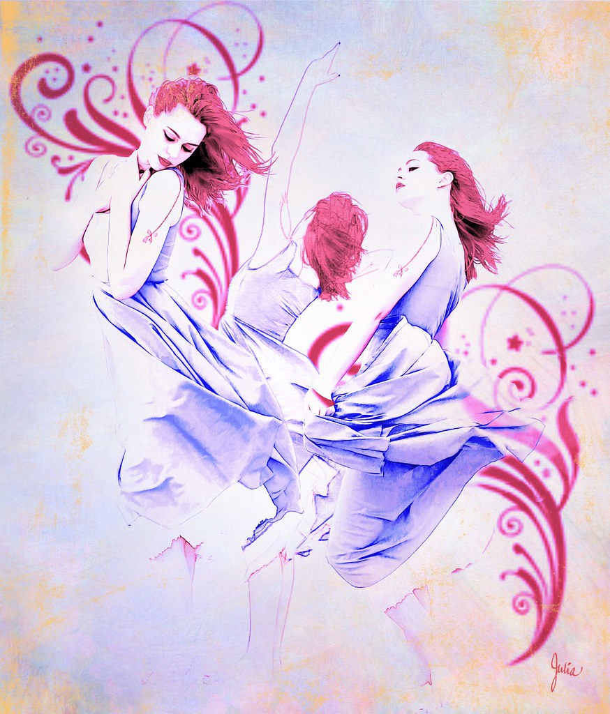
Illustration Friday - Swirl

 
Doing something is certainly more satisfying that merely thinking about doing it. And I have to say I got a lot of satisfaction and pleasure out of composing this piece for this week's Illustration Friday topic – Swirl. I have enjoyed the creative stimulation that Illustration Friday prompts on and off for several years, but there's been too long a hiatus between my last submission and now. So one of my goals for this year is to participate in IF each month.

I never know what I'm going to come up with, or what I'm going to end up with. Because this is nothing like I originally had in mind (which involved swirling smoke). While looking for Photoshop smoke brushes in deviant art, I got sidetracked and came across faestock's series of stock model shots with swirling skirts, and I thought I would just see what I might do with one or several of them.

The technical part for anyone who is interested: I chose three poses and removed the figures from the background. Each figure was duplicated twice. On the bottom copy I used Topaz Labs Simplify with the Pastel II filter (under Sketch), with that layer set to Normal, 100% opacity. On the next copy, I used Akvis Sketch with a Classic Fine Lines filter, with that layer set to Luminosity, 40% opacity. The top layer is the original set to Vivid Light and 100% opacity. I exaggerated the colors and saturation with a Hue/Saturation adjustment layer and also a violet Photo Filter Adjustment layer.

The red swirls are from Photoshop brushes which I've had for some time and may have also been downloaded from deviant art. The gold corners were done with some old Photoshop brushes called Paper Damage that I have found very useful, source unknown..The background is a Flypaper texture with the layer set to Multiply with a Hue/Saturation adjustment layer to change the colors and a circular gradient mask to lighten the center where the figures are.  

As always, I learn something or brush up on something (using channels to make a mask for selecting hair from the background) in Photoshop . Obviously, I could choose a topic or word at random and do this without the Illustration Friday interface. But, as I have said before, I find the deadline that must be met to post in that week's IF an effective spur to finish what I've begun.
 

Saturday, January 4, 2014

Illustration Friday - Reflect

The one-week time frame on Illustration Friday topics means you have to get thinking and starting doing, a good thing, right?  It also often means, for me, that come Thursday evening, I'm still working away furiously, trying out this and that on a composition that just hasn't quite come together.  Or I end up calling it done when I know that being able to look at it with fresh eyes in the morning would probably help me improve it.  All so I can link to the topic on the IF website. 

Thus it was this past Thursday when I hit Save for the final time a bit after midnight and prepared for the rigamarole of uploading to Flickr, posting on my blog and linking to Illustration Friday.  Only to discover that the topic had already been changed!  And that after IF had been so lax lately in changing topics promptly; the last one had been up for over two weeks.  Well, does it really matter if I submitted my work offiically?  It's not a class, it's not a contest; I only get the satisfaction of knowing that I did it and that anyone browsing the submissions for that topic might decide to have a look at mine.  It's not the first time I missed the IF boat, but I do think the deadline is a good motivator. Unlike, say, making a garment that you want to wear, it's easy to let projects that have no purpose other than exercising your creativity just peter out or get put aside and never taken up again.  So I thank IF for encouraging me to put paid to each "assignment" I undertake, and, hopefully, for engendering self-discipline, which I believe is ever more important for us – ahem – older individuals.

Reflect

I wanted to illustrate both the sense of "reflect" as the act of thinking back or contemplating, as well as the physical mirroring of an image, as in water. My starting point was the silhouette, created from a photo of myself, in a "thoughtful" pose. Next I layered three textures from Lost and Taken as well as a photo shot through lace curtains out of one of my windows. Then I simply started trying out assorted graphics and parts of photos. ( At one point I had a bunch of butterflies, which seem to be my default decorative elements when I'm stuck.) The green vining foliage are some brushes I had downloaded some time ago, probably from Deviant Art, but I no longer remember their exact source. And finally, I selected the photo of the trees and creek which is at a lovely park here. All done in Photoshop, of course.  Linked or not, I'm glad I made the effort and pleased with the result. 

Friday, November 8, 2013

Illustration Friday - Secret


After congratulating myself in January for having attained my 2012 goal of doing one Illustration Friday per month, I didn't keep up this year.  And I managed this one only by a fluke, because I had given up on it yesterday when I should have had it finished in order to link it to IF.  But when I went to the IF website today to see what the new topic was, it had not yet been changed. So I worked on this a bit more until I was somewhat satisfied with it.  Only somewhat.  Sometimes things come together and sometimes they don't.

Thursday, August 15, 2013

Illustration Friday - Fresh


 I found this charming school girl in stockvault's free photos, and I thought she looked like the essence of fresh in her pristine white blouse.  She has her fresh, new notebook open, ready to write down what she is learning. (Perhaps a French lesson, and she is dreaming of the day when she will go to Paris.)  You can see the original photo on this stockvault link; I made a few changes, removing an item at the edge of the desk and most of print from the book, plus another ornament that was in her hair.  Then I made several copies on which I used different filters, blend modes and masks to arrive at the image you see here; I also changed the color of her jumper from black to dark blue and added the edge of the paper that overhangs the desk.

For the background, I used an abstract golden background I had previously made, on top of which I layered several photos of foliage in various blend modes simply to add texture and color and complexity.  The final step was the daisies (fresh as a daisy!) which I cut out from a photo from stock.xchng.

I never know what I will eventually think about each illustration I do until some time has passed and I can look at it more objectively.  When I have just finished one, I am usually somewhat amazed at what has taken shape from this combination of assorted elements, and there are always certain details that I am especially pleased with, that seem just right. So it is with this, and I hope it gives you a moment of enjoyment to view, as it gave me much enjoyment to make.

Wednesday, June 12, 2013

Illustration Friday - Sweet

Actually, this was last week's IF topic.  I missed the deadline, so, officially, I suppose this is an unofficial Illustration Friday entry.  However, I started on it and I was determined to finish it.  What I was aiming for was a digital scrapbook type look, inspired by the accomplished creations of Anja de Dobbelaere.  (And while you're at Pinterest, check out the fabulous posters she's done for Zapparade, a street theater festival in Belgium.)  It seemed so do-able:  start with a photograph or two on some background papers, artistically add some trinkets and other ornamentation on the page, and voilà.  After struggling for far too long with my composition, I came to have a new appreciation of that voilà. Of course, I did probably increase the level of difficulty by trying to create my own digital scrap (new lingo!), scanning in assorted objects such as the lace edging and the buttons you see here, as well as others that I ultimately rejected. The "papers" are from Lost and Taken, a great site for free textures. The roses on top of those are one of my photos, filtered and masked. The daisy-type flowers are also cut out from one of my photos. The calligraphic frames are from a Dover book of Photoshop brushes. And the butterfly is from my old and much-used Click Art collection. Finally I decided it was done, done enough, acceptable, time to move on.

Sweet

The photographs are from a set of four that hung on the wall in my mother's bedroom.  They are of me, an only child, dated the year after my birth.  Did my mother put the newspaper clipping in front of one of them when they were first framed or she find it and tuck it there later?  And did she cling to the sentiments it expresses through all the years of our often-extreme mother-daughter conflicts, or did she wonder what ever could have happened to that sweet child she once had?  I was, as in the clipping, a daddy's girl, but despite all the differences between my mother and myself, I am sure she did indeed do her best for me.  I thank her for my love of nature and gardening, for teaching me to sew, for showing me the pleasures of reading, as well as for other, more intangible qualities that have helped me through life.  I think of this composition not as being about me, but rather as a tribute to my parents, and especially to my mother, who gave me as good a start in life as any child could ask for.

Thursday, April 18, 2013

Illustration Friday - Wild

Wild
About the only thing remaining from my original concept for this topic are the tigers. I intended for it to have a stylized, naive look, à la Henri Rousseau, but instead I've ended up with this extremely layered and busy composition. Last night I was on the verge of jettisoning it, but after viewing it afresh this morning, I decided that a bit more work and some additional layers would make it acceptable to add to my Illustration Friday oeuvre.

Except for three layers of Fly Paper textures, all of the elements are from stock.xchng. The tigers and crane were removed from three separate photos. The background consists of a photo with the pond on the left and another with the rocks on the right, plus one with trees at the top. Then there are a variety of ferns from three more photos. All put together with assorted blend modes and filters and masks, in Photoshop, of course. Is it believable? Does it work? Hmmm...   I always seem to end up in the "more is more" camp.

Thursday, January 31, 2013

Illustration Friday - Wings

One goal for 2012 that I succeeded in fulfilling was monthly participation in Illustration Friday. (Yeah!)  And it's my firm intention to continue doing so this year.  Thinking of all the ways a topic can be interpreted and then trying to get an idea, a vision that's interesting and not clichéd as well as interesting to execute really revs up the ole creative apparatus.

Fortunately, there aren't any topic police (and some submissions to IF have a very tenuous connection to the topic), because, as you can see, the "wings" in my illustration here are more or less gratuitous.  Or perhaps merely decorative would be a kinder way to put it.  I labored on a totally different concept for more than a day, finally concluding that it wasn't working and I didn't like it.  This one sort of evolved, starting with the young woman who came out of a vintage photograph from The Graphics Fairy, the best site I've found for vintage graphics and illustrations.  After making a composite of several layers of her, with different filters and blend modes, I started searching Lost and Taken for a textured background.  At this point I was simply involved in the image that was evolving, no longer focusing on "wings," although there were a couple of random butterflies left over from my previous abandoned attempt.  Then the next day I thought of adding a landscape to the background, and after much experimentation with effects, I was pleased with the result.

I couldn't let all that time and effort go to waste, could I?   So I threw in a few more butterflies, with drop shadows, of course. (When in doubt, add drop shadows.)  And, voilà, Wings!

Wings

Thursday, December 13, 2012

Illustration Friday - Explore

Explore In the course of illustrating this topic, I discovered and explored a whole new world that I had no idea existed: fantasy map making. Just Google "fantasy maps" to see an incredible variety. This simple map took hours to do, several of which were spent perusing the many online resources, such as Cartographer's Guild.  That's where I found a link to a tutorial on creating a realistic coastline. And all those hills and mountains, trees and the couple of lakes – made with free Photoshop brushes downloaded from Deviant Art.  Now, the castle and the ruin are my own handiwork, created from photos and reduced to icon size.  The map "paper" is from Lost and Taken which offers a wonderful selection of textures, also for free.  The distressing brushes used on the map were downloaded a few years ago, so I no longer know their origin, but they are so useful.

The rest of the composition was done a bit hurriedly since time was running out.  The mountain scenery as well as the binoculars and the compass were found on stock.xchng, my favorite hunting ground for free photos. I used Topaz Simplify filters on the mountain photo with a warming Photo Filter layer to bring the tone more in line with the map.  The compass and binoculars were simply cut out from their background, with a Find Edges filter on a duplicated layer above, set to Multiply.

I try to use my Illustration Friday submissions to learn and do something different each time. Making a map certainly was that!

Thursday, November 1, 2012

Illustration Friday -Haunt

Haunt This was an unfinished Illustration Friday from two years ago that seemed perfect for this week's theme.  What I kept of my original effort was the background landscape, photographed by me on a very foggy day at Queen Wilhelmina State Park in Arkansas, and the old sepia image of the lovely woman. All composed in Photoshop, of course. I used the Topaz Simplify filters on the landscape, and there are a couple of adjustment layers on it to further alter the tone, as there are also on the image of the woman.  The moths are from a collection of graphics I have had and used for many years: Broderbund ClickArt 200,000. It's a 14-disc set containing all sorts of images, fonts, photos, and which you can still buy on eBay and the like.  These are not hi-res images, but I still find them very useful for everything from making greeting cards to incorporating in montages. Underneath the landscape layer there's also a grey border layer on top of the white background layer. And that's it! 

Thursday, October 18, 2012

Illustration Friday - Water

Water
For this topic I photographed a glass of water from an odd angle on a sunlit window sill. I replaced the background with a photo of foliage and white flowers, using a box blur on one copy, setting the other copy below it to Hard Light at 10% which gave a slight imprint of the flowers on the blurred background. There are several copies of the glass, set to various blend modes to achieve the coloring and effect I wanted. On one copy of the glass I also used a tutorial from The Psyche Studios on how to turn a photo into a sketch.  The window sill has a texture layer from Lost and Taken.  And, lastly, I played around with creating water effects, trying out some of the many water tutorials on Photoshop Roadmap.  The two that I liked best were by Ivan Raszel and a very similar one from Iceflow Studios.  All in all, I have twenty-four layers on this simple-looking image.  I feel somewhat ambivalent about it but have decided that I did it, so I'm turning it in, so to speak...my October effort for Illustration Friday. 

Thursday, September 20, 2012

Illustration Friday - Burst

Burst My mind was bursting with ideas for this one. I finally settled on trying to illustrate something bursting from a book, a vividly written one, certainly.  The book itself with its burst page proved relatively simple.  I photographed a book, then stabbed a sheet of paper to create the burst effect and photographed that and overlaid it digitally on the book page, all with a bit of masking and blend modes.  I found the photos of the lorakeet and the leopard as well as the ferns on Stock.XCHNG .  The background came from Lost and Taken. There's also one of my photos of a crepe myrtle in bloom on top of that, at a very low opacity, just to add a bit more texture and color. It was interesting and I got it done with only minutes to spare.  Enough said. 

Sunday, September 2, 2012

Designing woman

Tall
There are several hundred submissions to Illustration Friday each week, so, of course, I never look at them all.  Still, I'm surprised that I never came across any of Nickey Linzey's work, as I discovered she has a been a regular contributor.  On IF's newly revamped website, the "thumbnails" are now quite large, making it easy to see which ones you find appealing.  Now tell me, don't you find Nicky's take on "Tall" appealing?

Once I had clicked over to her blog, I was totally entranced by what I would call her designing fluency.  Trying to decide which couple to show you here called for great restraint on my part because each one is a delight, an arresting interpretation of the topic. You must go see for yourself.  And you'll enjoy not only her wonderful illustrations but also her charming views of rural England where she lives.

Freeze

Tuesday, August 28, 2012

Illustration Friday - Tall

Tall
I can't believe it's only Tuesday and I already have finished the Illustration Friday weekly topic which I chose for this month. What came to my mind was a poem I long ago memorized: "Sea-Fever" by John Masefield, poet laureate of England from 1930 until his death in 1967   
I must down to the seas again, to the lonely sea and the sky,
And all I ask is a tall ship and a star to steer her by,
And the wheel's kick and the wind's song and the white sail's shaking,
And a grey mist on the sea's face, and a grey dawn breaking.

I must down to the seas again, for the call of the running tide
Is a wild call and a clear call that may not be denied;
And all I ask is a windy day with the white clouds flying,
And the flung spray and the blown spume, and the sea-gulls crying.

I must down to the seas again, to the vagrant gypsy life,
To the gull's way and the whale's way where the wind's like a whetted knife;
And all I ask is a merry yarn from a laughing fellow-rover
And quiet sleep and a sweet dream when the long trick's over.
 So off I set to find some photos of tall ships.  This one I used above is from Bruce Clayton on Flickr.
The night sky with its moon and star is a morguefile photo by mensatic.  I also incorporated two textures from Flickr's Best Textures group: Old photo texture bw by Essence of a Dream and Texture #18 by Shelly Freedman. Much of the credit for my timely completion of this little opus is due to my fabulous new Photoshop plug-in, Topaz Simplify which is specifically designed for digital art and painting.  Check out the Topaz Software group on Flickr to see what others are creating with the entire range of Topaz plug-ins.

While I really liked what I had done with the above composition, it wasn't what I had started out with in my mind's eye.  So, feeling on a creative roll, I concocted another version which was closer to my original vision.

Tall-2

The ship here is from **Mary** on Flickr.  All the other components – the night sky and the two textures – are the same.  And use of Topaz Simplify filters also.  Lots of layers and blend modes that I won't bore you with, but if you are interested, please email me and I'll be happy to tell you more about the inner workings of these compositions.  I say this because I often study digital images that I admire to try to suss out their secrets, and I appreciate every little bit of info that I can use to improve my own work. 


Thursday, July 19, 2012

Illustration Friday – Lost

I had something totally different in my mind's eye for this topic, but after gathering a selection of photos from stock.xchng and playing around with them in Photoshop, what was in my mind's eye refused to materialize.  This is what happened instead.

Lost

There's the bottom image: Jungle morning by cendol – "on Gunung Gede, an inactive volcano, close to Bogor in West Java, Indonesia. The steam is coming from a hot water spring."  It's set to Darken blend mode over a white background. Layered over that is Archway by saine – "...from the Marble Mountains, north of Hoi An in Vietman."  It's set to Hard Light blend mode with the edges masked out to transparency.  Over in the right hand corner are some ferns from Wood by alitaylor – "New Zealand rainforest."  I used only a tiny portion of that image set to Linear Dodge blend mode; the rest is masked out, and there is additional shading and a bit of cloning from the other side of the image to darken that area. The child is from Flower Girl by nem youth – "Flower girl walking outside after the wedding." The girl was the only somewhat difficult element, mostly in terms of making her fit the image tonally. She's extracted from a bright, sunny image and after making her a Smart Object, she was adjusted with Shadows/Highlights, also has a slight Gaussian blur and a Paint Daubs filter. There is more shading and some distressing on her dress. So that's it. I think it captures a mysterious, dream-like atmosphere, with the child adding an enigmatic narrative element.

For those of you who haven't come to this page via Illustration Friday, do go have a look at their revamped website.  BIG thumbnails...so much easier to browse the entries.

Friday, June 29, 2012

Shiny birds

One more bird post.  It turned out that birds with shiny objects were a popular interpretation of the Illustration Friday topic "Shiny."  I thought it would be interesting to present a selection, showing what a range of styles you'll see from the artists who submit there.  Be sure to visit all of their blogs/websites to see more of their wonderful work.

The first is from professional  illustrator Mikela Prevost.  About her process, she says "I do a sketch on stretched watercolor, then do a tracing of the sketch on tracing paper that will later serve as my "pattern" later for cutting out clothes or other objects that require collage. I then do the tight nitty-gritty watercolor work and then reward myself with acrylic and gouache messiness to round out the rest of the background. The collage is then applied and then for kicks and giggles, I go back with acrylic or gouache to mussy-up the whole thing."

The next is by Elizabeth Rose Stanton, another professional who specializes in children's book writing and illustration,  listing her skills as "pen & ink, graphite, watercolor, pastel, some computer stuff."


Here is a very different take in acrylic and graphite on watercolor paper from illustrator Rachel Fuji who "hope[s]  my artwork creates dreamlike, fleeting atmospheres filled with soft, intricate details that allow the viewer time for quiet reflection."

Amanda Dilworth is a freelance illustrator and surface pattern designer in England.

And here is Cyndi Tanner's submission.  She's a recent graduate with a degree in illustration who works "mainly in mixed medium, goauche, ink, dyes, graphite; enhanced digitally. I also am in love with textures and love to experiment with them."

Stephen Macguignon, a children's book illustrator, says "I interpret the words written on a page by telling the story behind the story working with pen and ink and then digitally coloring."


Thursday, June 14, 2012

Illustration Friday - Shiny

Shiny

A crow  peering at a shiny object seemed a natural for this week's Illustration Friday topic.  I'm quite fond of crows, having had one as a pet when I was a wee girl back in Indiana.  For the crow, I searched for Creative Commons images on Flickr.  Wow, are there a lot of photos of crows!  I'm always interested in how something is created, so I thought I'd show you the raw material, i.e. the photos, that went into this composition and explain what I did.  Here is the crow photo I chose from Sean McCann's Photostream.

Crow First I extracted the crow and the major branch he's sitting on from the photo, then cloned out some of the small branches that overlapped the crow and the major branch.  Next I filtered one copy of the crow, using Poster Edges and Film Grain filters, set to Hard Light blend mode.  Using a technique from this Photoshop tutorial, I ran another copy through the Find Edges filter, then copied and filtered that copy twice again, the first and second set to Overlay blend mode, the third to Lighten.  There's a Hue/Saturation adjustment layer clipped to the crow, to bring the saturation down and and remove the warm brown tone of the original photo.


 After I was satisfied with the crow, I searched for a ring photo from Stock.xchng .  I cut the top ring out of this photo, ran the Find Edges filter on two copies, one set to Multiply at  50% opacity, the next to Color Burn at 100% opacity, both over the top of the ring photo.  And, of course, all three layers have a mask so the ring is "caught" on the little stubs of the tree branch.

There's a blue "watercolor" background done in Painter, and then over that is my photo of ginko leaves, also filtered with Poster Edges and Film Grain. There's one copy set to Color Burn at 17% over a second copy set to Luminosity at 40%; both copies have masks that correspond to the blue watercolor layer.
Finally I put a yellow gradiant glow on a separate layer – Color blend mode, 68% opacity – above the ring to focus attention on it. Underneath it all is a solid white layer.  The title Shiny was done using the instructions for metallic type in an old Photoshop book on type effects.

Okay, if anyone who doesn't do Photoshop read all that, I'm sure you're yawning by now.