Showing posts with label Photoshop. Show all posts

Saturday, August 31, 2024

Fantasy with Anole

 “Wild: Perspectives in Fiber” was the theme of the 2024 Dallas Area Fiber Artists annual show which was exhibited from July 1 to August 10 at the C.C. Young senior living community where our meetings are held. I reworked an image I had created many years ago for Illustration Friday, consisting of a photo taken in my yard of a Fatsia japonica plant with a background of ferns, plus a photo of a Texas native green anole. 


After a lot of experimentation in Photoshop, I sent the image off to Spoonflower, as I had last year, and had it printed on cotton/linen canvas. Once again, I have to rave about how beautifully all the subtle color and texture of the image is reproduced. I then embroidered the outlines and veins of the leaves with several colors of embroidery floss, using mainly stem stitch and back stitch. I also outlined the anole and gave him a gold bead eye. Mr C made the fame, and I painted it with the same metallic green paint as last year. 

I didn't really break any new ground creativity-wise here, being, for one thing, pressed for time. But I enjoyed making it, and I was glad I participated in the show. Next year I'm promising myself to do something totally different. Well, we'll see...

Monday, July 31, 2023

The Women

Who are these women? I admit to feeling a slight reluctance in appropriating these images, although they are offered free to use on sites such as Pixabay and Pexels, or in the case of the third image, as an asset included in one of the Photoshop Artistry courses I'm taking. There is something slightly odd about staring at and working on a picture of someone who is looking back at you when you have no idea of who they are or why the photo was taken. But I have to say that doing these let me flex Photoshop skills that pictures of flowers and landscapes haven't much called for. 

The Beauty   

In this first image, The Beauty, the woman is indeed a beauty and I did nothing on her face but lighten the color of her lips, and I used the mixer brush to better shape her braid. Her earring was changed by stamping a bit of a lace brush over a base color. I used a Hue/Saturation layer to change and lighten the color of the yoke of her garment. Then I created a pattern with leaf brushes for the rest of the garment; and to make the folds, I painted in shadows and highlights on a neutral grey (dodge and burn) layer. The pattern around her head was done with several of Kyle Webster's foliage brushes on different layers in different blend modes. I finished with Topaz Impression for a more painterly look and added a Photoshop filter texture. 

 MythosIn Mythos, after cropping the picture below her bust and extending the background above her head and to the right, I both cloned and painted in additional hair on top of her head and to the right. Her eyes were enlarged using the Liquify filter. A bra strap showing on her shoulder was cloned out. The tip of the one piece of her necklace that was under the garment was replaced and additional light put on the necklace. I cut out some ivy for her crown and toned it to match the composition. In the background are some barely discernible trees from a winter forest photo. I added the warm colors above originally to relate to her dress which was burgundy, but ultimately I decided to change it to green. There are two painterly textures on the entire piece.

Attraction I probably did the most work on the model in Attraction. First of all, not wanting the tattoo she had all down her back, I found a great Piximperfect video about how to remove tattoos. I also used frequency separation to retouch her skin, especially smoothing out her face, subtly colored her lips and brightened her eyes. Highlights were added to hair with touches of rose-tinted white set to overlay. The background consists of two texture layers from Tangie Baxter, and some French Kiss script. The sheer tulle under her hand is from Foxeysquirrel. Finally I added three butterflies extracted from Pixabay photos.

Friday, June 30, 2023

Flower Power

 The Dallas Area Fiber Artists annual exhibition begins tomorrow, July 1. This is the first time I have participated; Marbled Rose and Popcorn Hydrangea are my entries. 


Toward the end of April, I chose two flower photos which I had taken long ago. In Photoshop I altered colors of the leaves and backgrounds and found that the conté crayon filter produced some interesting effects. Overall I applied a find edges filter and enhanced that with some outlining by hand. To the rose photo in the background, I also added a medieval-style design.

Then I sent them off to Spoonflower to be printed on a fat quarter of cotton/linen canvas. (In case you haven't discovered Spoonflower, be sure to have a look. In addition to having your own design printed, you can choose from a delightful plethora of designs from others and have them printed on a selection of different fabrics or even on ready-made items, such as pillow covers and curtains.) In one week Spoonflower sent back the printed fabric, and it looked terrific!

That was really only the beginning. My initial plan with to hand embroider all the outlines on the leaves and the flowers, emphasize the centers with French knots and sprinkle some beads about. After hours of work on the hydrangea image, I realized that it would take me way too much time to embroider all the outlines, so I became selective. And when I did the rose, I decided to limit the embroidered outlines to the flower itself. It's actually a bit difficult to see all the embroidery as much of it blends in with the printed image.

I listened to the entire audiobook of Barbara Kingsolver's Pulitzer Prize-winning Demon Copperhead and got a good start on Remarkably Bright Creatures by Shelby Van Pelt during my embroidery sessions. As I said to Mr. C, I don't think there is going to be an embroidered flower picture series. But all in all, I'm pleased with these two.

Mr. C made the frames, and I happened to have just the perfect color of metallic green paint.

Today I took them to CC Young, a beautiful senior living community where DAFA holds their meetings, and where the exhibition is being shown. It was gratifying to already receive compliments on my work while everything was being set up. And I enjoyed chatting with other members about their (very diverse) pieces as they brought them in. Can't wait to see the entire show when I go back for the next DAFA meeting in another week.

Monday, May 29, 2023

Beyond the village

Beyond the village

 Unlike with film rolls of the past, where you didn't want to waste your 24 or 36 shots, digitally you can click away (and delete) with abandon. But sometimes you keep a less-than-stellar image because, well, it was a lovely place and you'll probably never be there again. As I did with my view overlooking the town of Château-Censoir where we had stopped on our boat trip down the Canal du Nivernais in France. 

To transform it into the backdrop for this composition, I used Camera Raw in Photoshop, Topaz Impressions and the Paint daubs filter in Photoshop, plus a texture applied to the sky. All this to tone, add contrast and some vignetting, plus give it a more painterly look.

Next, I found a great fox image by JackerKun in Pexels. Jesús Ramirez has an excellent video on how to cut out fur from busy backgrounds on the Photoshop Training Channel. I also used this technique on the two chipmunks (also from Pexels, by Skyler Ewing), although they are so tiny the work on their fur is not apparent. While the fox is looking up somewhat in the original photo, I used Photoshop's Puppet Warp to turn his head and thus his gaze more skyward, and I toned him to blend into his surroundings

The photo of the hawk by Petr Ganaj in Pexels was so sharp that I slightly blurred all but the head to give it a more realistic look in terms of the composition. I also added three birds on the skyline with a bird brush. The last touch after the chipmunks was some detailed bits of shrubbery around them.

As usual, it took me way too long to do. But getting each step, each element just right is so absorbing that time flies by. And I feel so fortunate to get to spend my time doing something that I love.

Tuesday, February 28, 2023

Crafting a portrait - Lady in lace

Lady in lace

 While I hope that this appears to be a painted portrait, it was actually crafted in Photoshop. Since people/faces have rarely been a subject of my digital efforts, it required quite a bit of learning and experimentation and careful attention to detail.


I began with this model shot by faestock from Deviant Art. She already has quite lovely skin, but I refined it even more by using several skin retouching techniques from a video by digital artist and photographer Caroline Julia Moore in one of the Photoshop Artistry courses that I have been taking. I extended the background above her head by cloning and also into the areas where I masked out her hair below her ears.


Next, I “dressed” her in this Irish lace collar from the Costume Institute of the Metropolitan Museum. There are many, many images of all types of garments from different eras which can be copied and used under the Met's Open Access policy. I first extracted the lace from the background and then shaped it to the neck and shoulders of my figure using the Liquify filter.

 The hair proved to be one of the biggest challenges. After watching a YouTube video on how to paint braids in Photoshop, I searched for images of braided hair to copy and was rewarded by a photo of an actual braid in Pexels. I extracted parts of the braid, then shaped them using the Puppet Warp tool. A lot of color toning and overpainting was needed to make them look as if they actually were part of her hair. I found this simple YouTube video on painting hair to be very helpful.

Her pearl earrings and the pearls in her hair were easily painted with just the circular marquee tool and a soft round brush.

The background consists of several textures plus my photos of the vine with the violet flowers (wish I knew what they were!), all in different blend modes. The figure was masked out of all of these because I didn't want any textures on her. There was also toning on the figure and additional shading on both the right side of the background and on the lace.

The final step was to use Topaz Impressions to achieve that painterly look.

I spent a tremendous amount of time on it, I added to my digital skills, and I'm pleased with the result. Time to begin on the next one!


Sunday, July 31, 2022

What medium it is supposed to be?

 That's what Mr. C asked me when he looked at my latest oeuvre, Gazing into the pond. Well, I was going for a watercolor-esque effect, but not actually trying to exactly simulate a watercolor. Because digital art has a legitimacy of its own. It is what it is, and mastering its tools is no different than learning to wield pencil or brush and paints skillfully and effectively.

I liked the composition of the original photo with the arc above and the circles of ripples below anchored by the fish in between. But it took color toning, assorted tweaking and, yes, the selective use of a filter, plus some over-painting to achieve the look that satisfied me. In fact, there's such an abundance of options, of ways to color and tone, to sharpen or soften, to add effects, to draw and paint, that just knowing (or deciding) when you've done enough is a skill in itself. 

Reflections of summer  

I'd earlier created a much less painterly image with a photo taken at the same time. In that I had liked the intricate detailing of the reflections in the water and chose to emphasize that, but the major noticeable difference between it and the photo is the color that was brought out. 


As you can tell from my images on Flickr, I don't have a distinctive “style.” I love the freedom that digital art offers. I open Photoshop each time with a sense of anticipation. I may have an idea of what I want, but the path to the finish always has some fortuitous surprises. And always I learn more of how to manipulate the fabulous medium of digital art.


Thursday, March 31, 2022

Welcoming Spring

Back in March 2020 I snapped some pics of a swath of snowdrops. Finally this March I transformed one, using Photoshop and Topaz. Since my original photo was at most mediocre, I began by running the cropped image through Topaz Sharpen AI, but I didn't see a great deal of difference. I especially wanted to bring out the detail in the blossoms, so I used Precision Detail in Topaz Studio. Then I went to Topaz Impressions to create a painterly effect and finished with a Find Edges filter in Photoshop, toning it with a cooling Photo Filter adjustment layer. I added a white border which set off the image, but I still felt it wasn't finished.


For the final composition, I used a technique from one of my Photoshop Awake lessons. The entire image (without the Find Edges layer) was masked out and then selectively painted back in (on the mask) using watercolor brushes. Then the Find Edges layer (blend mode multiply) was put on top. Next I added some watercolor splatters around the edges. And to extend the edges of the image I cloned translucent sections onto the white border. The final touch was a soft border painted with a watercolor brush and blurred.


Snowdrops

 Working on a flower image in Photoshop is always a delight, and I did enjoy creating this.

Sunday, August 29, 2021

The magic of Blend Modes in Photoshop

Jardin du Luxembourg 

For creating digital images as art, Photoshop offers so many features that it would be difficult to single out any particular one as being the most essential or most useful. And what you use also depends on the type of art you're doing. Of course, it's knowing how to use the ensemble of Photoshop's fantastic tools that lets you realize your vision. Or, not infrequently, conjure up an image that comes as a complete surprise.

Blend modes – how a layer interacts or blends with the layer underneath — are basic to using Photoshop effectively and achieving seemingly infinite effects. Everyone who uses Photoshop regularly probably knows the groups of blend modes that darken, that lighten, that affect midtones, etc. But what I find addictive is simply running through all the blend modes on a layer to see what magic might occur.

Which is what more or less happened with the Jardin du Luxembourg image above. 

Sunday, May 30, 2021

Without a pattern

La Belle aux Fleurs

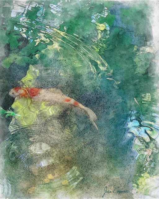
Landscapes, flowers, nature seem to be my natural digital subjects. But there is always the internal exhortation to try something different, especially when admiring what other digital artists are doing with the human face and figure. For more inspiration, I also collected a Pinterest board of women's images in various artistic styles. Yes, I could do this!

I began by extracting the woman from the background in a Pixabay image by Pat La Paz and giving her a painterly look with Impression in Topaz Studio 2. On my photo of the flowers taken at the Dallas Arboretum, I used copies with Akvis Sketch and Topaz Impression, as best I can remember, since those initial steps were many days and layers and blends modes back at the beginning of the month. Then more blend modes and layer masks to incorporate the woman with the flowers. Plus some background textures from Kirsten Frank.

And then? Frustration! I thought I knew the sort of elements I wanted to add to complete the composition, but nothing worked, nothing looked right. I returned again and again to study other images, to try to plumb their secrets and apply similar effects to mine. And here is where I began to think of the analogy of making a dress without a pattern.

It seemed to me that this was akin to seeing several beautiful dresses and deciding that I wanted to make a similar one. Not an exact copy of any one of them, but something with the same sort of skirt as this one and bodice like that one and sleeves from another. Only there was no such thing as a pattern to show me how to cut it out and construct it. Even as a very experienced sewer, I still need a go-by, especially when trying to make a complex garment. Alas, there was no pattern for what I wanted to do digitally.

Of course, Sebastian Michael's excellent PhotoshopArtistry and Awake: Photoshop Mastery Edition courses contain a wealth of how-to information as well as inspiration. And if specific help is needed, a quick search will turn up a variety of YouTube videos (thanks to which I finally succeeded in painting a new hairdo on the model). But all this instruction then has to be applied to something unique: one's very own creation, like that hypothetical hybrid dress.

Eventually, with the addition of a butterfly from Pixabay, a French letter from the Graphics Fairy and a château from one of my own photos, I declared La Belle aux Fleurs finished. And I'm ready to try another. And another. Just as, over the years, I sewed and sewed until I had an easy confidence in my garment-making skills. I may still need that pattern when making a dress, but I no longer have to rely on it completely or follow it exactly. In fact, the more I have learned to go beyond the pattern, the more my satisfaction in sewing has increased. I only hope it won't take me that long to reach the same point in digital art.


Sunday, March 28, 2021

Watercolor camellias


If you take brush in hand to sweep a luscious wash of color onto a sheet of fine, textured paper, you may be shaking your head at my efforts to duplicate your results digitally. So, are my watercolor camellias ersatz? Obviously I am working with pixels rather than pigment, applied using Photoshop brushes created by KyleT. Webster, with a GrutBrushes Art Surface paper texture as my base. And, I admit that underneath all is a photo from which my composition emerged.

Emerged, yes, ever so slowly. To me, one of the advantages of making art digitally is the ability to try and retry, to discover new techniques, to toss away what doesn't work and keep refining until what you see begins to accord with what you imagined. Quite a few hours sped blissfully by before I put my signature on this deceptively simple image. And the fact that, unless I print it out, I have a virtual rather than an actual artwork is perhaps an advantage, as I can enjoy seeing it anytime on my computer screen, rather than having it tucked away and forgotten somewhere in a drawer.

Ultimately, I think what a “real” watercolor and this digital watercolor have in common is that they both spring from a desire to create and the delight that comes from being able to do so in whatever medium you choose.

Wednesday, February 24, 2021

A jewel of a tool

 For creative photo editing Topaz Studio 2 is a jewel indeed. It can be used as a standalone application or as a plugin for Photoshop or Lightroom. With its panoply of filters you can do everything from subtly enhancing an image to rendering it as differently and dramatically as you desire. But all those filters with all their adjustments can be intimidating. Where to start? Which ones to use? How do they all work?

After bumbling around, I started watching Dave Kelly's extensive series of YouTube videos on Topaz Studio 2 which cover everything from showing you exactly what each filter does to how to use them in combinations for artistic results. It was thanks to those sessions that I was able to transform the photo of Cedar Creek Falls snapped at Petit Jean State Park in Arkansas into a scene that I might actually frame. 


Original photo
 

In Topaz Studio 2 I used a combination of AI Clear, Precision Contrast, HSL Color Tuning plus the Impression filter. It's really in looking at a closeup of the two images that you can appreciate the full impact of the changes. (The sky was replaced in Photoshop itself and the birds were added via a brush from the Birds of a Feather collection by Midnightstouch.) I'm just in awe of all the creative power at my fingertips. And as Dave Kelly is always exhorting his viewers, don't be afraid to experiment! All the choices, all the possibilities can be overwhelming, but the more you use it, the more you'll appreciate this jewel.

Thursday, December 31, 2020

Moonlit Château

 Sometimes it's one thing to clearly see in your mind's eye what you want to create and quite another to make that creation a reality. I began on this piece in early December, worked on it on and off throughout the month, and just put the final layer in place this morning. At last!  Perhaps I could call this Slow Photoshop, somewhat like the Slow Sewing movement.

One of my inspirations for this piece was the Day to Night lighting effect demonstrated by Glyn Dewis in the November Photoshop Virtual Summit. Here is my original and not very good photo of the Château de Montreuil-Bellay in the Loire valley in France. After removing most of the background, I was able to greatly improve it using primarily AI Clear in Topaz Studio 2. Then came many, many layers to tone it and work on details for the moonlit effect. 

The sky with the moon is overlaid on another sky with all the stars and both are from Pixabay. The deer and the stag are also from Pixabay while the trees and shrubbery to the left and the grass in the foreground are from my photos. There's even a texture from Kerstin Frank thrown in for good measure.

I could probably have continued piddling around on subtle improvements, but I think I have come close to the vision in my mind's eye. And while it took me a long time to get here, the journey with Photoshop is always amazing.


Monday, November 30, 2020

On our walk


Monarch butterflies have been plentiful in Dallas this fall on their annual migration south. (One year I even found a tagged one which I still have carefully preserved.) Out on a walk one afternoon this month we came upon this glorious vine that was hosting several. I discovered later that it's a Mexican flame vine, Pseudogynoxys chenopodioides, a plant species related to asters. Now, to be honest, all those Monarchs weren't so artfully arranged when I snapped the photo, but Photoshop lets you compose the picture that should have been. Also used Topaz Impressions for a more painterly look. A delight to do.

Saturday, October 24, 2020

Window on Munger Place


Here's another piece arising from the Awake course mentioned in my last post. It doesn't precisely relate to any of the lessons, but did come about as a result of my desire to participate in all the digital creativity.

I began with the photo of one of the front windows of our house, then added the background photos of the tall pink phlox which have been blooming all summer in a front garden. The swallowtail butterflies came from Pixabay, but there always seems to be one or two of them flitting around the phlox. The text is from the original promotional brochure for Munger Place which was developed in 1905. And the ornament is from Dover's 2,286 Traditional Stencil Designs.

I have to mention (okay, brag) that back when we first bought the house, the sashes of all 27 original windows in the house were removed and stripped, then repaired and refinished by me. And most, including the one above, received a redo a couple of years ago. However, a set of triple windows on the side missed out, until in June their deteriorating condition could no longer be ignored. 

Of course, when we bought the house in the 1970s and set about restoring it with boundless energy and optimism, I had no idea that decades later I would still be turning my hand to many of the same things. Back then it was an adventure, and this big, derelict house was a canvas which we could freely fill with our ever-evolving vision. Now we can enjoy the house we saw in our mind's eye, but it still requires behind-the-scenes work to keep it that way. It is, after all, 110-years old!  

And I am, well, let's just say, quite a bit older than I was in the 1970s. But I credit all that behind-the-scenes work with helping me stay in shape. And now that those windows are checked off my to-do list, I can get back to exercising my mind with more digital exploration.

Saturday, September 19, 2020

Ninety-nine percent perspiration


I had been mired in Photoshop frustration for some time. When I looked through my images for a starting point, nothing came to me. Nothing especially “creative.” I felt I should have been been bubbling over with ideas since beginning Sebastian Michael's Awake course this summer.

Its full title is “Awake: The Photoshop Mastery Edition” and it follows the original Photoshop Artistry course that I had mostly completed last year. Even though I am relatively Photoshop-competent and have been piling up layers and applying blend modes with abandon for some time, I hoped these courses would not only teach me new skills but also propel me into greater digital creativity.

One unexpected benefit has been finding myself a part of a community of equally Photoshop-obsessed souls all around the globe. Before I could look at and study their compositions via the monthly Living the Photo Artistic Life Magazine, the photoshopartistryInstagram feed or the Fine Art Photoshop Flickr group, but now I feel I can interact with them more fully if I choose.

Many of these people have built up a large and enviable body of work. Ah, yes, work, that's the key word. Referencing the famous Thomas A. Edison quote, instead of Genius, I think you could certainly say Art “is one percent inspiration and ninety-nine percent perspiration.” So with that in mind, I sat myself down one morning and kept working away until I had put together the composition above. 

Friday, May 22, 2020

Digital diversions

Glimpse of a river in Arkansas
During this period of “sheltering in place,” we are fortunate, Mr. C and I, to have a place that shelters us most pleasantly. There's plenty of space where we can each pursue our individual interests undisturbed. This tumultuous time that has upended lives around the world has so far changed our days only slightly. In fact, I am almost grateful for the additional time that staying home all day every day has given me. 
  
When I haven't been spring cleaning or attending to the exuberance of greenery out in the yard, I've been immersed in pushing pixels around on my computer screen . After many years of using Photoshop CS3 (which debuted in 2007), I finally subscribed to Adobe's Creative Cloud Photography plan which includes the latest Photoshop and Lightroom Classic. Why had I been waiting!


Of course, I wanted to catch up to all the advances in Photoshop plus learn about Lightroom which I didn't have before, so I've been on a YouTube marathon. There are many, many excellent video tutorials given by people who really know the intricacies of these programs. I am simply amazed at both the depth of their knowledge and the seemingly infinite effects that are possible.


Anthony Morganti has been guiding me through Lightroom with his very clear and detailed series of Mastering Lightroom Classic CC. And I have long subscribed to Phlearn with Aaron Nace and PiXimperfect with Unmesh Dinda. As well as learning from their digital mastery, I appreciate their obvious enthusiasm for Photoshop. An enthusiasm which I share (and which Mr. C often wishes I did not share with him). 
 
So here I am, sharing it with you. The picture above is the result of my attempt to turn the very lackluster photo below into something worth looking at through the magic of Lightroom and Photoshop. It may not be an ah-inspiring masterpiece but I'm pleased with what I've achieved. In some respects I feel as if I were “painting” the scene in the original photo, enhancing and changing colors, adding some things and removing others, emphasizing various details while rendering other areas with less definition. Both medium and tools are at hand merely by turning on my computer and opening the programs. I find it totally addictive.


As a bonus, when I'm finished, no cleaning of brushes and removing errant streaks and smudges from hands and other body parts. Although I do kinda miss the evocative odors of paint and turp and linseed oil.
 

Monday, December 31, 2018

Hellebores

Hellebores
Our city lot is generously shaded by large trees, so I'm always on the lookout for plants that thrive in shade and in our North Texas soil and climate. Hellebores fit the bill, although, alas, they are both slow-growing and a bit pricey. You can't just plant a few and expect them to spread. There are, however, enviable swaths of them at the Dallas Arboretum where I snapped the original photo.
 
One of my Christmas presents (from me to me) was Topaz ReMask, a masking plug-in for Photoshop, so I tried it out on the hellebore image with great success. I played around with just the hellebores on a transparent background, using two other Topaz plug-ins, Adjust and Simplify on separate copies, then Akvis Sketch on another copy. I also enhanced the pinks with a Selective Color adjustment layer.

The background consists of soft, cloudy neutrals on one layer, a deep purple layer over that and two copies of a photo of ferns, one filtered with Topaz Simplify and one with Akvis Sketch. The real magic happens with the blending modes, and there are so many possibilities producing such different effects that I often find it difficult to decide which looks best. (And also find it difficult to stop tweaking.) I finally went with this result which I think makes the ferns look as if stamped or printed on a slightly metallic surface, and they ground the hellebores without distracting from them. There are also a few light touches of gold on top on the background image.

It's been a while since I've done anything “creative” in Photoshop. Because isn't it easy to put aside unessential pursuits for things that “need” to be done. But the satisfaction and pleasure that comes from those pursuits indicate that they are indeed essential, even if the world (or Flickr) isn't breathlessly awaiting another of my oeuvres.

Sunday, December 16, 2018

The Texas road map vest

I should really call this post The obsessional saga of the Texas road map vest. First, here is the result. 


And now I'm sure you're dying to know how and why it I made it.

To begin at the beginning (but skip on down if you'd simply like to know more of the how and not the why)...  Anyway, the beginning was my discovery via Meetup of The Dallas Area Fiber Artists.  I went to the October meeting which was attended by a large and diverse group of women (and a couple of men).  Liza Mackinnon gave a terrific presentation on her intricate paper clothing sculptures, several of which she brought to show. And they were what I had in mind when I started thinking about creating something Texas-themed for the November meeting and holiday party. 

Those free road maps you get at the welcome station to each state – how can you just throw them away? Pinterest has boards full of clever ideas on how to use maps. And I thought it was entirely possible that I could assemble a simple vest, wearable on one occasion, out of my Texas road maps. But as the idea evolved, it turned toward printing the map on fabric, and I was even able to find a pdf of the current Texas road map online, eliminating the need for scanning. 

Wednesday, April 4, 2018

Illustration Friday - Mushroom

For a number of reasons it's been nearly a year since I've participated in Illustration Friday. I usually do glance at the topic, and for this week's Mushroom, I had just the pics I wanted to work on. Here's what this mushroom looks like from a normal perspective. On the internet I discovered that it is Leucocoprinus birnbaumii, common in potted plants and greenhouses, but this was growing in a neighbor's flower border. I thought it was lovely and snapped several pics of it, including these from underneath which have received the usual intensive Photoshop treatment here. 


Mushroom triptych

Friday, March 30, 2018

Down in the Treme

Down in the Treme
I have to confess that I'm not sure this little house was in the Treme, although I do remember walking through it when we were in New Orleans in 2013. Anyway, I like to think it was, because Mr. C and I both loved the Treme series, recommended to me by an ami in France. At the end of 36 episodes, we felt like we knew the characters, that we had been there with them. And, oh, that Treme Song!

The Photoshop alchemy on the rather bland original photo included a technique for turning a photo into a line drawing from the Photoshop Artistry course I've embarked on. I also used Topaz Adjust on another copy of the photo. And I've layered two of the terrific textures that Cheryl Tarrant generously offered for free on her Flickr Photostream. As usual, lots of layers in various blend modes adding up to this effect. All in an evening's work. Although I really can't call anything this enjoyable work.