Monday, May 29, 2023

Beyond the village

Beyond the village

 Unlike with film rolls of the past, where you didn't want to waste your 24 or 36 shots, digitally you can click away (and delete) with abandon. But sometimes you keep a less-than-stellar image because, well, it was a lovely place and you'll probably never be there again. As I did with my view overlooking the town of Château-Censoir where we had stopped on our boat trip down the Canal du Nivernais in France. 

To transform it into the backdrop for this composition, I used Camera Raw in Photoshop, Topaz Impressions and the Paint daubs filter in Photoshop, plus a texture applied to the sky. All this to tone, add contrast and some vignetting, plus give it a more painterly look.

Next, I found a great fox image by JackerKun in Pexels. Jesús Ramirez has an excellent video on how to cut out fur from busy backgrounds on the Photoshop Training Channel. I also used this technique on the two chipmunks (also from Pexels, by Skyler Ewing), although they are so tiny the work on their fur is not apparent. While the fox is looking up somewhat in the original photo, I used Photoshop's Puppet Warp to turn his head and thus his gaze more skyward, and I toned him to blend into his surroundings

The photo of the hawk by Petr Ganaj in Pexels was so sharp that I slightly blurred all but the head to give it a more realistic look in terms of the composition. I also added three birds on the skyline with a bird brush. The last touch after the chipmunks was some detailed bits of shrubbery around them.

As usual, it took me way too long to do. But getting each step, each element just right is so absorbing that time flies by. And I feel so fortunate to get to spend my time doing something that I love.

Tuesday, February 28, 2023

Crafting a portrait - Lady in lace

Lady in lace

 While I hope that this appears to be a painted portrait, it was actually crafted in Photoshop. Since people/faces have rarely been a subject of my digital efforts, it required quite a bit of learning and experimentation and careful attention to detail.


I began with this model shot by faestock from Deviant Art. She already has quite lovely skin, but I refined it even more by using several skin retouching techniques from a video by digital artist and photographer Caroline Julia Moore in one of the Photoshop Artistry courses that I have been taking. I extended the background above her head by cloning and also into the areas where I masked out her hair below her ears.


Next, I “dressed” her in this Irish lace collar from the Costume Institute of the Metropolitan Museum. There are many, many images of all types of garments from different eras which can be copied and used under the Met's Open Access policy. I first extracted the lace from the background and then shaped it to the neck and shoulders of my figure using the Liquify filter.

 The hair proved to be one of the biggest challenges. After watching a YouTube video on how to paint braids in Photoshop, I searched for images of braided hair to copy and was rewarded by a photo of an actual braid in Pexels. I extracted parts of the braid, then shaped them using the Puppet Warp tool. A lot of color toning and overpainting was needed to make them look as if they actually were part of her hair. I found this simple YouTube video on painting hair to be very helpful.

Her pearl earrings and the pearls in her hair were easily painted with just the circular marquee tool and a soft round brush.

The background consists of several textures plus my photos of the vine with the violet flowers (wish I knew what they were!), all in different blend modes. The figure was masked out of all of these because I didn't want any textures on her. There was also toning on the figure and additional shading on both the right side of the background and on the lace.

The final step was to use Topaz Impressions to achieve that painterly look.

I spent a tremendous amount of time on it, I added to my digital skills, and I'm pleased with the result. Time to begin on the next one!


Tuesday, January 31, 2023

In Appreciation

While other activities I once participated in, such as the Skillman Players theater group, are now but memories, the Foreign Authors Bookgroup continues to be an ongoing, much-appreciated part of my life. And I think that most of the other members feel much the same, which I find both gratifying and surprising, because we are such a disparate group of women in many respects, brought together by our love of reading about world around us. I have enjoyed and learned, and more than that, I have gained new insights into my own character and viewpoints from our monthly discussions.

So when an assignment in a digital art course I am taking was to create an original work of photo artistry based on the theme of admiration for a dear friend, I modified it slightly as appreciation for all my friends in the bookgroup. As the assignment suggested, I did have it printed and have just sent a copy to each person in the group. 

We have already begun our 2023 reading slate with a short but moving Irish novel, Small Things Like These by Claire Keegan.  Next up is a French novel which I nominated, The Anomaly by Hervé Le Tellier which won the Prix Goncourt in 2020.  So, come the first Tuesday in February, I will find out the reactions of the group both to my "appreciation" card and to the unusual novel that I selected.  

Here is our complete schedule for the year.  


Saturday, December 31, 2022

Old City Park


Sullivan House

In 1876 it was Dallas's new and first City Park, gracing The Cedars, a fashionable neighborhood of Victorian homes. The 1885 Sullivan House above, decked out for the holidays, once stood nearby. Along with a variety of other historic buildings from the Dallas/North Texas area, it was moved to the park, which for a period of time was called Dallas Heritage Village. Now it's Old City Park again, with free regular admission, and a pleasant place simply to have a stroll on its wooded acres. Below on the left is the 1888 Renner School with a backdrop of downtown Dallas skyscrapers.

Old and new Among the wildflowers


Monday, October 31, 2022

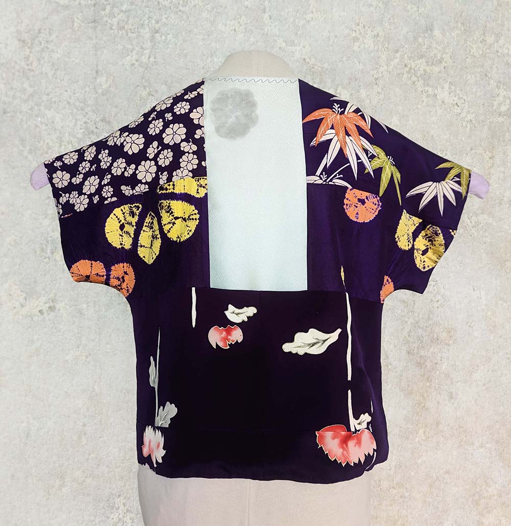
Silk samples top

One dollar bought a little hanger with five or six fabric samples. They had come from a seller of Japanese textiles who was retiring and were being offered at a meeting of the Dallas Area Fiber Artists. Most were gorgeous silks, of which I managed to acquire enough in related purples to piece together this top.

The pattern is adapted from Vogue 8497 by Marcy Tilton. And I didn't have a sample to spare! After deciding on the arrangement of the samples, I sewed them together with tiny one-eighth inch seams to create a whole piece of fabric from which I cut out the pattern. Then I lined the top with off-white silk crepe de chine from Dharma Trading Company.

All the different projects which DAFA members had made from the samples were displayed in a contest at the last meeting. Alas, I did not win a prize, but having this top to wear is reward enough. 


Thursday, September 22, 2022

Second time around

Once the fabric for this t-shirt was a totally different color with totally different designs. And it just wasn't right. Eventually I decided the only solution was to start over. Some yellow swirls refused to be removed, but I think they just add another layer of complexity under the new design.

For my new color, I wanted a pinky peach which I mixed using Deep Orange, Bazooka Pink and Dusty Rose. For the two contrasts I add some Pomegranate and some Nightshade. All of these are Fiber Reactive Procion Dyes from Dharma Trading Company (some colors no longer available), made up into dye concentrates which I apply by mixing with print paste. 

I began by stenciling the small swirls with a stencil I purchased from Michael's. Then without letting that dry, I used a natural sponge to dab a slightly lighter color mixed with a thinner print paste over all the pieces.

The second session was simply stenciling the one-half inch and one-fourth inch squares (cut on my Silhouette Cameo) in the two contrast colors. And that was enough, so, all in all, a fairly simple design to achieve. (Although all that stenciling and dabbing took quite a bit of time.)


The pattern I used is a copy I made long ago of L.L. Bean's Saturday T-shirt, which is a loose, boxy tee, super comfortable for summer. The fabric is a non-clingy cotton jersey from Dharma. It's so much easier to print the individual pieces while they're flat on a table and sew it up afterwards.

Sunday, July 31, 2022

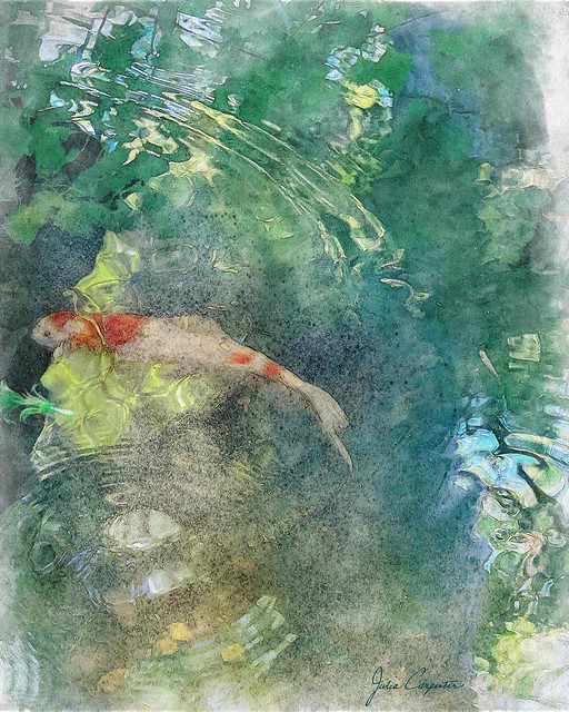
What medium it is supposed to be?

 That's what Mr. C asked me when he looked at my latest oeuvre, Gazing into the pond. Well, I was going for a watercolor-esque effect, but not actually trying to exactly simulate a watercolor. Because digital art has a legitimacy of its own. It is what it is, and mastering its tools is no different than learning to wield pencil or brush and paints skillfully and effectively.

I liked the composition of the original photo with the arc above and the circles of ripples below anchored by the fish in between. But it took color toning, assorted tweaking and, yes, the selective use of a filter, plus some over-painting to achieve the look that satisfied me. In fact, there's such an abundance of options, of ways to color and tone, to sharpen or soften, to add effects, to draw and paint, that just knowing (or deciding) when you've done enough is a skill in itself. 

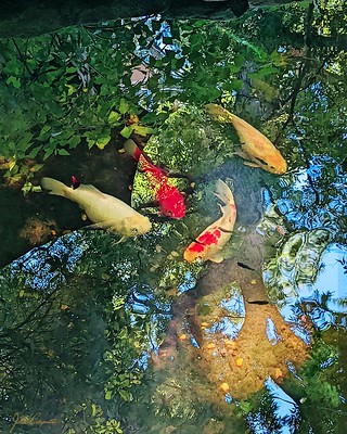
Reflections of summer  

I'd earlier created a much less painterly image with a photo taken at the same time. In that I had liked the intricate detailing of the reflections in the water and chose to emphasize that, but the major noticeable difference between it and the photo is the color that was brought out. 


As you can tell from my images on Flickr, I don't have a distinctive “style.” I love the freedom that digital art offers. I open Photoshop each time with a sense of anticipation. I may have an idea of what I want, but the path to the finish always has some fortuitous surprises. And always I learn more of how to manipulate the fabulous medium of digital art.