Sunday, July 31, 2022

What medium it is supposed to be?

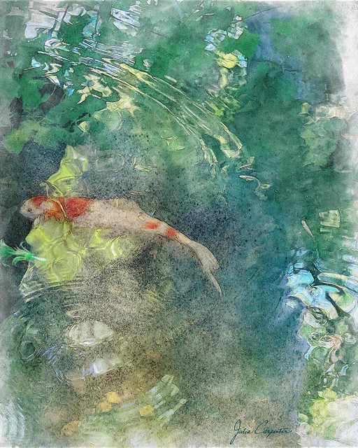
 That's what Mr. C asked me when he looked at my latest oeuvre, Gazing into the pond. Well, I was going for a watercolor-esque effect, but not actually trying to exactly simulate a watercolor. Because digital art has a legitimacy of its own. It is what it is, and mastering its tools is no different than learning to wield pencil or brush and paints skillfully and effectively.

I liked the composition of the original photo with the arc above and the circles of ripples below anchored by the fish in between. But it took color toning, assorted tweaking and, yes, the selective use of a filter, plus some over-painting to achieve the look that satisfied me. In fact, there's such an abundance of options, of ways to color and tone, to sharpen or soften, to add effects, to draw and paint, that just knowing (or deciding) when you've done enough is a skill in itself. 
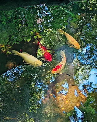
Reflections of summer  

I'd earlier created a much less painterly image with a photo taken at the same time. In that I had liked the intricate detailing of the reflections in the water and chose to emphasize that, but the major noticeable difference between it and the photo is the color that was brought out. 


As you can tell from my images on Flickr, I don't have a distinctive “style.” I love the freedom that digital art offers. I open Photoshop each time with a sense of anticipation. I may have an idea of what I want, but the path to the finish always has some fortuitous surprises. And always I learn more of how to manipulate the fabulous medium of digital art.


Tuesday, June 21, 2022

A simple pleated silk lampshade

I doubt someone seeing this simple pleated silk lampshade on the crystal table lamp between my living and dining rooms would have any idea of the work that went into it. Not to mention all the approach-avoidance angst. The minute I crowned the lamp with the newly completed shade, it seemed like it had always been there. And the flaws that were so disappointing to me as it sat on my work table also seem to disappear.

The original pleated fabric shade had begun to deteriorate some time ago, so when I came upon the book Shades of Light: Making Tailored Lampshades by Ruth De Fraga Gomes, I immediately ordered it. But possessing and perusing the book is rather like buying a pattern and feeling like you nearly already have the garment from it. After my initial enthusiasm, I reasoned that I had a good many other projects demanding my attention, so perhaps I would just buy a shade. 


 You would think that a simple pleated white fabric shade would be easy to acquire, but nowhere could I find the right size and shape, except by ordering a custom shade. So, since I already had the frame, and the detailed instructions, I decided it would be me making that custom shade.

Thursday, March 31, 2022

Welcoming Spring

Back in March 2020 I snapped some pics of a swath of snowdrops. Finally this March I transformed one, using Photoshop and Topaz. Since my original photo was at most mediocre, I began by running the cropped image through Topaz Sharpen AI, but I didn't see a great deal of difference. I especially wanted to bring out the detail in the blossoms, so I used Precision Detail in Topaz Studio. Then I went to Topaz Impressions to create a painterly effect and finished with a Find Edges filter in Photoshop, toning it with a cooling Photo Filter adjustment layer. I added a white border which set off the image, but I still felt it wasn't finished.


For the final composition, I used a technique from one of my Photoshop Awake lessons. The entire image (without the Find Edges layer) was masked out and then selectively painted back in (on the mask) using watercolor brushes. Then the Find Edges layer (blend mode multiply) was put on top. Next I added some watercolor splatters around the edges. And to extend the edges of the image I cloned translucent sections onto the white border. The final touch was a soft border painted with a watercolor brush and blurred.


Snowdrops

 Working on a flower image in Photoshop is always a delight, and I did enjoy creating this.

Sunday, January 30, 2022

We continue to read...

Through the never-ending pandemic, through alarming political turmoil, through our varied personal circumstances, we continue to read. Some of us have traveled, others, including myself, have remained at home. A few no longer even live in Dallas. Most are retired or only work part time, and we have very diverse interests and pastimes. Books are what brought us together.

So, year after year, we continue to read, sharing each month a passage to another time and place. This year began in late 19th century Venice and will end in mid 20th century rural Ireland, with sojourns across the globe along the way.


Thursday, November 18, 2021

In full bloom


I managed to keep the dyeing momentum going and turned out another cotton jersey tank top, bringing together several large flower stencils that I already had made for other projects. Nightshade is what Dharma Trading Company calls that lovely blue-cooled purple of their Fiber Reactive Procion Dye. I also used their Plum Blossom to give some variation on the blossoms. And, of course, Golden Yellow for the centers. 


After the dye had cured, I re-stenciled over the flowers with resist before silk screening on the foliage in Avocado green, so that it would be behind rather than over the flowers. (This was not entirely successful.) This foliage is another design from Dover's Chinese Stencil Design book. The foreword in the book only says that the designs are from a rare collection of Chinese stencils, without giving any specific dates or eras. Old enough, I'm sure, that their creators would be astonished to see their designs being brought to life via Photoshop and the Silhouette Cameo cutting machine that I used to make the silkscreen film.


When all the washing-out was done, the yellow centers were not quite as distinct as I wanted, so I embroidered them with a simple satin stitch, on the front only. 

So, voilĂ , another new top ready for next summer.  And more dyeing and printing practice to get me ready for my next project...whatever that may be.

Wednesday, September 15, 2021

Rekindling a passion

It's said that you never forget how to ride a bicycle, and I doubt that I would ever forget how to sew no matter how much time went by. Alas, I found that the same was not true of printing with dye on fabric.

I certainly never meant to abandon doing it. From the beginning I found it a delight. With each piece I created, I was eager to learn more, to try out new techniques. And then? Well, other projects, other interests, life... I cleaned the bottles of aging dye concentrates out of the little fridge I had bought just for them, put away the silk screens Mr C had made for me, folded up the table I worked upon, but I always planned to start again, soon.

And finally, later rather than sooner, I have. For this first project, I decided to adapt a design I had used on a couple of scarves to a tank top, so I could concentrate on the process rather than the design. I did a mock-up in Photoshop with the dye colors I planned to use. Then I relied on Color by Design: Paint and Print with Dye by Ann Johnston, which has been my guide for past efforts.

Because some of my dye powders were past their average shelf life, I tested the colors I intended to use; thankfully all were fine.

 The fabric is a sturdy cotton jersey from Dharma. The stencils I already had from the scarf project. The passion flower is an Art Nouveau design by E.A. Seguy from an old Dover Book. I adapted a leaf for an additional stencil. The background design is a motif from Dover Books Chinese Stencil Designs. First I stenciled on the leaves in green and the petals in resist so that they would stay white. Next I stenciled the stamens of the flowers in a dark purple. I also used that color on the stencil of the little sprinkles, some of which I also stenciled with resist.

Next I brushed on the overall color diluted with a thin print paste. Here, in order to make the color pale, I made it too liquid with the addition of urea water which dissolved some of the resist I had put on in the previous step. Finally I silk-screened the Chinese motif randomly over the front and back using a stronger version of the base color. Fortunately the resist that kept the petals white did not completely dissolve as I had feared, but it wasn't as crisp and clear as it should have been. I tried to remedy this by going over the petals with white Lumière paint, but it was difficult to align the stencil perfectly the second time. 

All in all, I'm pleased with the result. These tanks tops are what I wear around the house during our sweltering Texas summers, and I'm glad to have another one to add to my collection. I've already begun working on a design for my next one, even as summer is slowly slipping away. I'm hoping to keep some sort of dyeing project going from now on.  Time will tell...

Sunday, August 29, 2021

The magic of Blend Modes in Photoshop

Jardin du Luxembourg 

For creating digital images as art, Photoshop offers so many features that it would be difficult to single out any particular one as being the most essential or most useful. And what you use also depends on the type of art you're doing. Of course, it's knowing how to use the ensemble of Photoshop's fantastic tools that lets you realize your vision. Or, not infrequently, conjure up an image that comes as a complete surprise.

Blend modes – how a layer interacts or blends with the layer underneath — are basic to using Photoshop effectively and achieving seemingly infinite effects. Everyone who uses Photoshop regularly probably knows the groups of blend modes that darken, that lighten, that affect midtones, etc. But what I find addictive is simply running through all the blend modes on a layer to see what magic might occur.

Which is what more or less happened with the Jardin du Luxembourg image above.