
Thursday, October 18, 2012
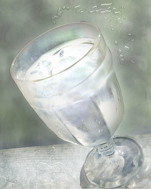
Illustration Friday - Water
Monday, October 15, 2012
Dye, dye again
 Here's the reprise of the concept that went awry in my previous dyeing
project. I'm pleased with this result, and I think
changing some of the elements improved my original idea as well. I
certainly came closer to achieving the color scheme I envisioned.
Here's the reprise of the concept that went awry in my previous dyeing
project. I'm pleased with this result, and I think
changing some of the elements improved my original idea as well. I
certainly came closer to achieving the color scheme I envisioned.
 To begin, I stenciled on the same flower I used in the previous try, this time using Jacquard Clear Water Based Resist, first time I had tried it. A strangely oily and much more liquid product than Presist. The bottle says that it is tintable with dye so I added a bit of the russet color I had made for an accent. However, I decided that wasn't the effect I wanted, so I washed it out, leaving behind faint images. Then I stenciled a different flower design with the resist, this time adding no color. You can just see their embossed-looking shapes in this photo. Next I silk screened on the same green shapes, cut out of freezer paper, as before, adding more blue to the green, mixed with print paste.
 After that I tried another silk screen technique, using drawing fluid to trace a fairly simple design from Dover's Chinese Stencil Designs. I simply printed out the design to the size I wanted, taped it to the screen and traced the design with a very fine brush. Since it was the first time I had tried it, I had no idea of how thickly the drawing fluid needed to be applied to work its magic. After the drawing fluid dried, I put a few spoonfuls of screen filler on my silk screen and pulled it across with the squeegee. Once that dried, the drawing fluid is supposed to be washed out with cold water. Yes, it worked; there was the design, ready to print!
  The final step was the violet background. Since so much blue had washed out previously, I made my violet much more blue than I wanted and lighter than last try. I applied it, mixed with print paste, with a small sponge roller. The next day I thought it was just too blue and used an inexpensive hobby air brush to spray on more violet dye that was a bit less blue, although I really couldn't see much effect from that. At this point the fabric was fairly wet, and I thought it possible that the resist-stenciled flowers had simply dissolved, as there was barely any visible trace of them.
After each step I let the dye cure overnight. Finally I was ready to wash my fabric... The resist-stenciled flowers slowly appeared, white against the violet background. They did resist the violet, but did not entirely resist wherever the green shapes or the russet design was printed on top of them. The faint russet-tinged images of the flowers I had originally stenciled and washed out are still there, adding a bit more complexity, which I like. The background lost a lot of blue as it had on my first time, so it came out about the color I wanted, if a bit lighter than I would have liked. All in all, it was worth trying this again. I can't wait to try other techniques, other colors. This is so much fun!
Sunday, October 7, 2012
Dye-sappointment
I saw it in my mind's eye: white flowers with rust centers, green shapes, a rust squiggle running through it all and a violet background. I stenciled on the flowers with some of my remaining Presist (a water-based resist), using Procion MX Fiber Reactive dye mixed with print paste on the centers. Then for the green shapes I finally utilized some of the silk screens Mr C kindly made for me a couple of years ago. So easy! I cut the shapes out of freezer paper, used a bit of masking tape to adhere the stencils to the silkscreen, then printed them using dye thickened with print paste.  Simple Screenprinting by Annie Stromquist, a Lark Book, is an excellent, user-friendly reference. There were three different shapes which I printed first in a darker green, then mixed with more print paste to give what I hoped would be an echoing color. On top of that I drew the rust squiggle with dye mixed with print paste in a fine wire-tipped squeeze bottle, which, unfortunately, kept snagging on the knit. So I went over it with the same dye mixture in a tjanting (used for applying wax for batik) which worked a bit better but wasn't stellar on close inspection.

I let each step dry for a day before proceeding to the next step. Finally I was ready for the violet. My biggest question was if the green shapes – dye mixed with print paste – would resist the violet dye. I brushed on a fairly dark shade of violet mixed with print paste and let it cure for a day.
 Then, with bated breath, I washed it all out. And washed and washed and washed, every bucket full of blue dye. Oh no! So instead of the leafy green and blue violet I had envisaged, I had a yellow green clashing unpleasantly with a mauve background. The rust centers of the flowers disappeared, and somehow the rust squiggle, which is barely visable, turned about the same green as the shapes.

So here is what I've learned. No 1 is that the particular blue dye I used, which I have had for much longer than recommended, must have lost some of its potency, although I did use it on the previous fish-stenciled top with no problems. Secondly, the dye mixed with print paste did work as a resist, however the second printing of the shapes which was supposed to be much lighter was almost the same color as the first. As to the color change and near disappearance of the squiggle and the flower centers, I have no idea. I'm trying the whole thing again. I know it's supposed to be about enjoying the process as much as the product, but I can't help but be a bit disappointed when the product falls short of what I envisaged. However, this particular product will not be abandoned and perhaps the process of salvaging it will prove more interesting than my original idea. So stay tuned!
Simple Screenprinting by Annie Stromquist, a Lark Book, is an excellent, user-friendly reference. There were three different shapes which I printed first in a darker green, then mixed with more print paste to give what I hoped would be an echoing color. On top of that I drew the rust squiggle with dye mixed with print paste in a fine wire-tipped squeeze bottle, which, unfortunately, kept snagging on the knit. So I went over it with the same dye mixture in a tjanting (used for applying wax for batik) which worked a bit better but wasn't stellar on close inspection.
I let each step dry for a day before proceeding to the next step. Finally I was ready for the violet. My biggest question was if the green shapes – dye mixed with print paste – would resist the violet dye. I brushed on a fairly dark shade of violet mixed with print paste and let it cure for a day.


So here is what I've learned. No 1 is that the particular blue dye I used, which I have had for much longer than recommended, must have lost some of its potency, although I did use it on the previous fish-stenciled top with no problems. Secondly, the dye mixed with print paste did work as a resist, however the second printing of the shapes which was supposed to be much lighter was almost the same color as the first. As to the color change and near disappearance of the squiggle and the flower centers, I have no idea. I'm trying the whole thing again. I know it's supposed to be about enjoying the process as much as the product, but I can't help but be a bit disappointed when the product falls short of what I envisaged. However, this particular product will not be abandoned and perhaps the process of salvaging it will prove more interesting than my original idea. So stay tuned!
Subscribe to:
Posts (Atom)