Thursday, December 13, 2012

Illustration Friday - Explore

Explore In the course of illustrating this topic, I discovered and explored a whole new world that I had no idea existed: fantasy map making. Just Google "fantasy maps" to see an incredible variety. This simple map took hours to do, several of which were spent perusing the many online resources, such as Cartographer's Guild.  That's where I found a link to a tutorial on creating a realistic coastline. And all those hills and mountains, trees and the couple of lakes – made with free Photoshop brushes downloaded from Deviant Art.  Now, the castle and the ruin are my own handiwork, created from photos and reduced to icon size.  The map "paper" is from Lost and Taken which offers a wonderful selection of textures, also for free.  The distressing brushes used on the map were downloaded a few years ago, so I no longer know their origin, but they are so useful.

The rest of the composition was done a bit hurriedly since time was running out.  The mountain scenery as well as the binoculars and the compass were found on stock.xchng, my favorite hunting ground for free photos. I used Topaz Simplify filters on the mountain photo with a warming Photo Filter layer to bring the tone more in line with the map.  The compass and binoculars were simply cut out from their background, with a Find Edges filter on a duplicated layer above, set to Multiply.

I try to use my Illustration Friday submissions to learn and do something different each time. Making a map certainly was that!

Monday, December 10, 2012

Leaf silhouettes

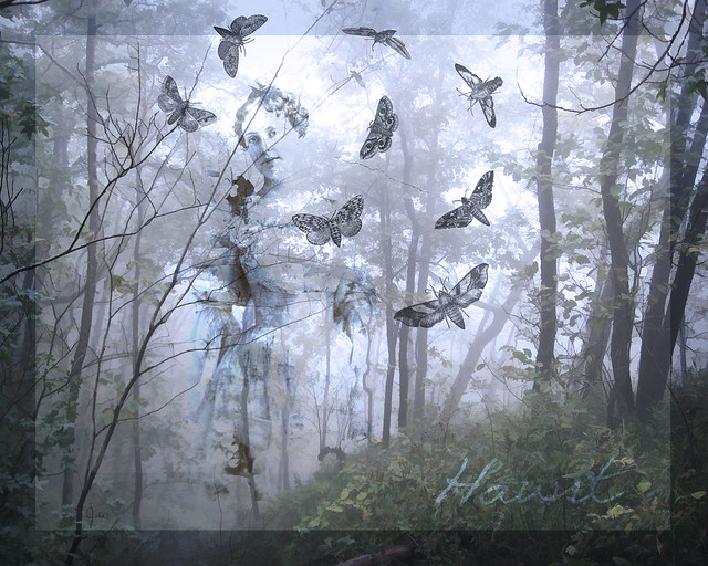
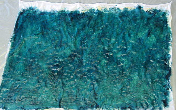
This time of year I can't resist plucking particularly enticing leaves from the rich panoply of shapes and colors strewn on the sidewalk.  Then I tuck them into books where I come across them months later, brown and brittle.  I always think that I will do something creative with them, but what?

Here's one idea that I found on Pinterest, but instead of using paint, I did it the non-messy way: digitally. It's so easy, and here's how to do it.  I'm using Photoshop CS3, but I'm sure you can do the same in any similar program. .

First scan in each of your leaves.  Next, create a new file whatever size you want for your finished composition.  I made mine 8"x10" with a 150 pixels/inch resolution.  Now, on each scan, select the leaf; it's easiest to first select the white background and then inverse your selection.  You'll probably also have a tiny bit of shadow around parts of your leaf which you'll need to remove from your selection.  (I used the lasso tool.)  Then just drag your selected leaf over to your newly created file. Each leaf will be on a separate layer. You can then arrange them in any order that you wish by moving the layers above or below each other.  And you can rotate the leaves, even resize them.

Once you have the composition that you like, select all the leaves by holding down Shift & Ctrl while you click each layer.   Now, go to the Select menu, choose Save selection, name it and click OK.  Do all this again, omitting the bottom leaf; save and name that selection.  Continue to repeat this procedure, each time omitting the next leaf in your stack.  Then select, save and name your top leaf.  At this point, you can delete the leaf layers, if you wish, or simply turn them off.

Finally you're ready to start having some fun! First create a new empty layer on top of the white background layer.  Next, load the selection that contains all of the leaves and then INVERSE the selection.  With your brush tool selected, choose Airbrush soft round from the tool drop-down bar.  Set the opacity to around 30% and the flow about the same.  Choose a foreground and a background color.  I started with a golden yellow and an orange.  In the brush palette, you can check Color Dynamics and move your Foreground/Background jitter to around 50%, and the same with your Hue jitter and Saturation jitter.  This will just give you more variation in the color you put down.  Increase your brush size to 300 pixels or above and sweep around the outline of the leaves.  At this point all of the leaves will remain white; you are only painting the background.  When you're satisfied with how that looks, deselect your selection.

Load your next selection which does not include the bottom leaf, and remember to INVERSE the selection.  You will now be painting OVER the bottom leaf and around the outlines of the other group of leaves.  I reduced the opacity of my brush and changed my colors slightly.  Remember, if you don't like something you can undo it, or skip several steps back in the History palette.  Or in the History palette, you can make a snapshot each time you've finished a step and are happy with the result.

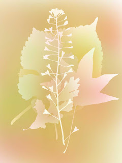
Continue loading and painting around each selection of leaves until you have only the final one on top; just go over that very lightly with your brush.  I actually did this four different times on separate layers, changing my colors a bit  each time.  I played around with various blend modes on those four layers but finally left them all at Normal.  Because none of the layers were totally opaque, all together they added richness to the color.  And that's the result you see right here. Then on one of the layers, more or less by accident, I added a drop shadow which created the unexpected effect you see above.  And I changed the blend mode on the layer beneath it to Dissolve.

Which just goes to show how much variation you can achieve with this basic technique.  So collect some leaves, scan them in, and experiment away!  (And, in conclusion, may I say that I had no idea how difficult it is to write a simple Photoshop tutorial. I hope I've made it clean enough.)
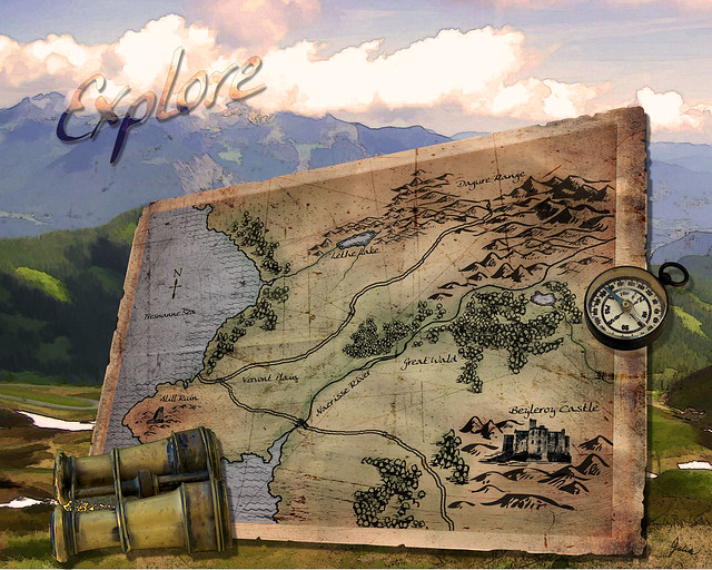
Wednesday, December 5, 2012

Scarves - up to my neck in dye


The dyeing and printing go on. I even bought a mini-fridge in which to keep my dye concentrates, as they were usurping the condiments' space in the kitchen refrigerator. I might reach in and pull out a container of #9 scarlet when I actually wanted red wine vinegar. So the purchase of the mini-fridge seals my commitment to continue. In fact, I liked the results of my last two tank tops so much that I thought I would try to duplicate them on rayon scarves. I thought that I had learned enough about what I did that I could duplicate them.  Ah...not quite.

Nevertheless, it was instructive (as well as frequently frustrating), and now I'm ready to move on to some different motifs, colors and techniques. I can hardly wait to see what comes about, since my novice efforts don't seem to render what I envision at the start.  But that does make it interesting.   

Friday, November 16, 2012

A new leaf

Actually a lot of new leaves – blue ginkgo leaves – rescued the original disappointing dyeing outcome which you can see here.  I eyed it without much hope for a few weeks and then decided to act.  Just a yard of fabric, just some time spent and some dye used, nothing except my own satisfaction riding on the result.  The first thing I did was restencil the flowers with a resist, impossible, of course, to align the stencil perfectly with the existing flowers, but ultimately I liked the sort of off-register effect that it created.  Then using a very detailed mosaic stencil I went over the entire piece of fabric with thickened blue dye; you can really only see a hint of that in the background.  Next, I traced some actual ginkgo leaves and cut stencils of them which I used to screen print both in blue and blue-purple.  I followed that with screen printing on the Chinese stencil design that I used on the previous tank top. That color, Black Cherry, made the ginkgo leaves look too pale, so I printed on more in darker shades of the blue and blue-purple.  VoilĂ , it was finished, and I was more than pleased.  Of course, the process was not as effortless and straightforward as I just described.  Rather it was quite time-consuming and there were a lot of "oh nos!" along the way.  (See those little dots of blue?  They began as some accidental drips, but ended up, in my opinion, enhancing the design after I decided to sprinkle dots all over.)

 
And just a note, for anyone interested in screen printing, I've discovered a great material to use as stencil film, rather than freezer paper which has a finite lifespan.  I was at JoAnn Fabrics when I wondered if tablecloth vinyl would work.  And, yes, it does!  I purchased the thinnest vinyl which was less than $3 for a 60" wide yard, so it's a really cheap material, and the resulting stencil can be washed and re-used ad infinitum.  It's also extremely easy to cut; in fact, it's necessary to go very easy with the Exacto knife. I used it for the ginkgo leaves as well as recut the squiggly shapes in it, so I think it's a real find.

Thursday, November 1, 2012

Illustration Friday -Haunt

Haunt This was an unfinished Illustration Friday from two years ago that seemed perfect for this week's theme.  What I kept of my original effort was the background landscape, photographed by me on a very foggy day at Queen Wilhelmina State Park in Arkansas, and the old sepia image of the lovely woman. All composed in Photoshop, of course. I used the Topaz Simplify filters on the landscape, and there are a couple of adjustment layers on it to further alter the tone, as there are also on the image of the woman.  The moths are from a collection of graphics I have had and used for many years: Broderbund ClickArt 200,000. It's a 14-disc set containing all sorts of images, fonts, photos, and which you can still buy on eBay and the like.  These are not hi-res images, but I still find them very useful for everything from making greeting cards to incorporating in montages. Underneath the landscape layer there's also a grey border layer on top of the white background layer. And that's it! 

Thursday, October 18, 2012

Illustration Friday - Water

Water
For this topic I photographed a glass of water from an odd angle on a sunlit window sill. I replaced the background with a photo of foliage and white flowers, using a box blur on one copy, setting the other copy below it to Hard Light at 10% which gave a slight imprint of the flowers on the blurred background. There are several copies of the glass, set to various blend modes to achieve the coloring and effect I wanted. On one copy of the glass I also used a tutorial from The Psyche Studios on how to turn a photo into a sketch.  The window sill has a texture layer from Lost and Taken.  And, lastly, I played around with creating water effects, trying out some of the many water tutorials on Photoshop Roadmap.  The two that I liked best were by Ivan Raszel and a very similar one from Iceflow Studios.  All in all, I have twenty-four layers on this simple-looking image.  I feel somewhat ambivalent about it but have decided that I did it, so I'm turning it in, so to speak...my October effort for Illustration Friday. 

Monday, October 15, 2012

Dye, dye again

Here's the reprise of the concept that went awry in my previous dyeing project.  I'm pleased with this result, and I think changing some of the elements improved my original idea as well.  I certainly came closer to achieving the color scheme I envisioned.


To begin, I stenciled on the same flower I used in the previous try, this time using Jacquard Clear Water Based Resist, first time I had tried it.  A strangely oily and much more liquid product than Presist.  The bottle says that it is tintable with dye so I added a bit of the russet color I had made for an accent.  However, I decided that wasn't the effect I wanted, so I washed it out, leaving behind faint images.  Then I stenciled a different flower design with the resist, this time adding no color. You can just see their embossed-looking shapes in this photo.  Next I silk screened on the same green shapes, cut out of freezer paper, as before,  adding more blue to the green, mixed with print paste.


After that I tried another silk screen technique, using drawing fluid to trace a fairly simple design from Dover's Chinese Stencil Designs.  I simply printed out the design to the size I wanted, taped it to the screen and traced the design with a very fine brush.  Since it was the first time I had tried it, I had no idea of how thickly the drawing fluid needed to be applied to work its magic.  After the drawing fluid dried, I put a few spoonfuls of screen filler on my silk screen and pulled it across with the squeegee.  Once that dried, the drawing fluid is supposed to be washed out with cold water.  Yes, it worked; there was the design, ready to print! 

The final step was the violet background.  Since so much blue had washed out previously, I made my violet much more blue than I wanted and lighter than last try.   I applied it, mixed with print paste, with a small sponge roller.  The next day I thought it was just too blue and used an inexpensive hobby air brush to spray on more violet dye that was a bit less blue, although I really couldn't see much effect from that.  At this point the fabric was fairly wet, and I thought it possible that the resist-stenciled flowers had simply dissolved, as there was barely any visible trace of them.

After each step I let the dye cure overnight.  Finally I was ready to wash my fabric...   The resist-stenciled flowers slowly appeared, white against the violet background.  They did resist the violet, but did not entirely resist wherever the green shapes or the russet design was printed on top of them.  The faint russet-tinged images of the flowers I had originally stenciled and washed out are still there, adding a bit more complexity, which I like. The background lost a lot of blue as it had on my first time, so it came out about the color I wanted, if a bit lighter than I would have liked.  All in all, it was worth trying this again.  I can't wait to try other techniques, other colors.  This is so much fun!

Sunday, October 7, 2012

Dye-sappointment

I saw it in my mind's eye: white flowers with rust centers, green shapes, a rust squiggle running through it all and a violet background.  I stenciled on the flowers with some of my remaining Presist (a water-based resist), using Procion MX Fiber Reactive dye mixed with print paste on the centers.  Then for the green shapes I finally utilized some of the silk screens Mr C kindly made for me a couple of years ago.  So easy!   I cut the shapes out of freezer paper, used a bit of masking tape to adhere the stencils to the silkscreen, then printed them using dye thickened with print paste.  Simple Screenprinting by Annie Stromquist, a Lark Book, is an excellent, user-friendly reference. There were three different shapes which I printed first in a darker green, then mixed with more print paste to give what I hoped would be an echoing color.  On top of that I drew the rust squiggle with dye mixed with print paste in a fine wire-tipped squeeze bottle, which, unfortunately, kept snagging on the knit.  So I went over it with the same dye mixture in a tjanting (used for applying wax for batik)  which worked a bit better but wasn't stellar on close inspection.

I let each step dry for a day before proceeding to the next step.  Finally I was ready for the violet.  My biggest question was if the green shapes – dye mixed with print paste – would resist the violet dye. I brushed on a fairly dark shade of violet mixed with print paste and let it cure for a day.

Then, with bated breath, I washed it all out.  And washed and washed and washed, every bucket full of blue dye.  Oh no!  So instead of the leafy green and blue violet I had envisaged, I had a yellow green clashing unpleasantly with a mauve background.  The rust centers of the flowers disappeared, and somehow the rust squiggle, which is barely visable, turned about the same green as the shapes.


So here is what I've learned.  No 1 is that the particular blue dye I used, which I have had for much longer than recommended, must have lost some of its potency, although I did use it on the previous fish-stenciled top with no problems.  Secondly, the dye mixed with print paste did work as a resist, however the second printing of the shapes which was supposed to be much lighter was almost the same color as the first.  As to the color change and near disappearance of the squiggle and the flower centers, I have no idea.  I'm trying the whole thing again.  I know it's supposed to be about enjoying the process as much as the product, but I can't help but be a bit disappointed when the product falls short of what I envisaged. However, this particular product will not be abandoned and perhaps the process of salvaging it will prove more interesting than my original idea.  So stay tuned!

Sunday, September 30, 2012

Photographer...and poet

Speaking of talented people, I should have long ago introduced John Saxon, long-time friend and photographer extraordinaire.  Back in the day when we first met, John was focusing on dress shirts and designer shoes, giving those commercial shots the same meticulous attention that he now devotes to his own creative pieces.  Here, three of his virtuoso still lifes.

Rope & Bottle Oil & Dice Nikon

And a collection of randomly chosen shots that show both his discerning eye and his superior skill.

Saucer MagnoliaSprinklersPincushion
Pelicans Luna MothYou can see more of his varied work on Flickr.

And the poet part?  In one of my February blog posts, after rhapsodising about Photoshop, I asked if anyone had ever penned an ode to it.  John took up the challenge with this clever little verse.
I think that I shall never crop
with any app but Photoshop.
In shining layers thirteen deep
deciding what or not to keep,
with filter bold and brush in hand
I make my photo seem as planned;
though only God can make a tree,
in Photoshop it's up to me.

Thursday, September 20, 2012

Illustration Friday - Burst

Burst My mind was bursting with ideas for this one. I finally settled on trying to illustrate something bursting from a book, a vividly written one, certainly.  The book itself with its burst page proved relatively simple.  I photographed a book, then stabbed a sheet of paper to create the burst effect and photographed that and overlaid it digitally on the book page, all with a bit of masking and blend modes.  I found the photos of the lorakeet and the leopard as well as the ferns on Stock.XCHNG .  The background came from Lost and Taken. There's also one of my photos of a crepe myrtle in bloom on top of that, at a very low opacity, just to add a bit more texture and color. It was interesting and I got it done with only minutes to spare.  Enough said. 

Wednesday, September 19, 2012

Enthusiastics in the garden

"Enthusiastics" is what I have dubbed those eager and able plants which a more fastidious gardener would probably call "invasives."  Ages ago when I decided to make a proper perennial garden, I poured over gardening books and catalogs, noting every seductive specimen which seemed as if it might thrive here if lavished with care.  I hunted for them in local nurseries, I ordered from the catalogs, I planted packets and packets of seeds.  And for a brief moment in time I had...a North Carolina garden in Dallas. It was lovely, and it was high maintenance.  Time passed and trees grew, veiling more and more sun, while I grew a bit weary of all that work. So now what blossoms around my house are the survivors that decided they liked it here just fine, with ample water and fertilizer but without being coddled.

Ruellia brittoniana
The hardiest of the bunch has to be Mexican petunia, Ruellia brittoniana, which blooms from spring until frost. In searching online for its botanical name I read an interesting comment by a Houston environmentalist: "It's not establishing a monoculture, just holding its own, part of a complicated new balance. Butterflies love it. So is it really invasive? Does it deserve to be branded with the scarlet letter I?"  It grows in the sun, it grows in the shade, it manages with little water, all the while thrusting up bright purple flowers with happy abandon.  It does send out roots everywhere, but I simply yank them up where they're not wanted.  And it shoots out seeds like tiny bullets when signaled by a good drenching with the hose. 

Phlox paniculata
Physostegia virginiana
 In contrast to the ruellia which was a from a friend's yard, two other stalwarts were carefully chosen in  that first foray into perennial gardening.  The vivid pink tall garden phlox, Phlox paniculata, mingles prettily with the ruellia all summer long. I bought it so long ago that I don't remember its specific name. It does spread by roots but not so rampantly.  Right now it's winding down its blooming season just as obedient plant, Physostegia virginiana, is unfurling its frothy, delicate-looking petals along foot-tall stems.  The common name comes from their tendency to remain positioned however you bend them. They also spread moderately by roots.

Clematic terniflora
Sweet autumn clematis, Clematis terniflora,  has just burst exuberantly into bloom in the past couple of weeks or so.  Originally I planted it alongside our fence in the back, but here it is crowning some shrubs by the front porch, its seeds conveyed in our homemade mulch, I assume.  How can I mind its unmannerly presence when it wafts its delicate fragrance out near the front door?

Mirabilis jalapa


An even more intoxicating scent is emitted by the four o'clocks, Mirabilis jalapa, so called because it opens its blossoms late in the day.  It seems to be classified as an annual, but does come back from its roots here, as well as self-seed prolifically, abundantly.  I am constantly pulling up errant seedlings all during the growing season.  But, oh, to enhale that luscious odor at twilight is certainly worth a bit of effort.  I wish I could post a sample of that scent here instead of merely a photo of its simple flower.  Mine are a hot pink but they come in a variety of colors as well as multicolored. I took some seeds from a plant growing more or less wild alongside a former railroad track in the middle of the city.

There are some others, but as this post is getting lengthy, I think I'll write about them another day.  All of these plants make themselves at home in both some sun and even in quite a bit of shade where they might not bloom prolifically but at least do provide carefree foliage.  I let them sort themselves out as to who gets to be dominant in their various gardens areas, and they carry on with panache.  The other morning a woman walking her dog complimented me on the display out front, and when I replied that everything there was easy to grow, she said, "that's your secret."

Wednesday, September 12, 2012

Behind the scenes

When we bought our house in the 1970s the term "urban pioneer" was au courant, and we were definitely oh-so-energetic.  Like us, most of the other young couples lured both by the potential of these large, derelict houses and by their inversely small prices were doing much of the renovation work themselves.  Times, of course, have changed, and today it's rare to see homeowners here in Munger Place wielding their own tools.  Except for us.  Mr. C and I, being loathe to deal with workmen, still engage in hard and dirty manual labor.  So here we are reroofing the large back room which was added to the house sometime during its twenty-five-year stint as a nursery school.  (It was an upholstery workshop when we bought it.)

A good start on day one.
Many, if not most, of the things required for home repair and maintenance aren't that difficult once you acquire some rudimentary skills.  (It also is quite helpful if one of you is an engineer.)  And a good selection of tools is essential.  After that, it's just work, much of it repetitious and either messy or dirty or both.  Fortunately, once you have moved beyond the steep home renovation stage to the home maintenance plateau, the amount of labor subsides.  And the necessity for it can be conveniently overlooked or willfully ignored.  But not when the first rain since June brings water cascading from the ceiling into every bucket and pan that can be enlisted into service.  So, supplies were purchased, tools were gathered and out we went to put it right.

Coming along nicely on day four.
The second half awaits.


It's not so bad once you get started, once you accept that you're going to be hot and dirty and tired, but you are going to get the job done. We were lucky to have some out-of-the ordinary-for-August coolish days at the beginning, and we only worked for a few hours in the mornings.  And, then, ah, what could be nicer than getting all cleaned up and doing what you please, in air-conditioned comfort, for the rest of the day!  So here's the end, roof replaced, deck refurbished, and we're none the worse for wear, I'd say.

Cheers!
Now we've moved on to repairing and refreshing the room that's under that roof. 

Sunday, September 2, 2012

Designing woman

Tall
There are several hundred submissions to Illustration Friday each week, so, of course, I never look at them all.  Still, I'm surprised that I never came across any of Nickey Linzey's work, as I discovered she has a been a regular contributor.  On IF's newly revamped website, the "thumbnails" are now quite large, making it easy to see which ones you find appealing.  Now tell me, don't you find Nicky's take on "Tall" appealing?

Once I had clicked over to her blog, I was totally entranced by what I would call her designing fluency.  Trying to decide which couple to show you here called for great restraint on my part because each one is a delight, an arresting interpretation of the topic. You must go see for yourself.  And you'll enjoy not only her wonderful illustrations but also her charming views of rural England where she lives.

Freeze

Tuesday, August 28, 2012

Illustration Friday - Tall

Tall
I can't believe it's only Tuesday and I already have finished the Illustration Friday weekly topic which I chose for this month. What came to my mind was a poem I long ago memorized: "Sea-Fever" by John Masefield, poet laureate of England from 1930 until his death in 1967   
I must down to the seas again, to the lonely sea and the sky,
And all I ask is a tall ship and a star to steer her by,
And the wheel's kick and the wind's song and the white sail's shaking,
And a grey mist on the sea's face, and a grey dawn breaking.

I must down to the seas again, for the call of the running tide
Is a wild call and a clear call that may not be denied;
And all I ask is a windy day with the white clouds flying,
And the flung spray and the blown spume, and the sea-gulls crying.

I must down to the seas again, to the vagrant gypsy life,
To the gull's way and the whale's way where the wind's like a whetted knife;
And all I ask is a merry yarn from a laughing fellow-rover
And quiet sleep and a sweet dream when the long trick's over.
 So off I set to find some photos of tall ships.  This one I used above is from Bruce Clayton on Flickr.
The night sky with its moon and star is a morguefile photo by mensatic.  I also incorporated two textures from Flickr's Best Textures group: Old photo texture bw by Essence of a Dream and Texture #18 by Shelly Freedman. Much of the credit for my timely completion of this little opus is due to my fabulous new Photoshop plug-in, Topaz Simplify which is specifically designed for digital art and painting.  Check out the Topaz Software group on Flickr to see what others are creating with the entire range of Topaz plug-ins.

While I really liked what I had done with the above composition, it wasn't what I had started out with in my mind's eye.  So, feeling on a creative roll, I concocted another version which was closer to my original vision.

Tall-2

The ship here is from **Mary** on Flickr.  All the other components – the night sky and the two textures – are the same.  And use of Topaz Simplify filters also.  Lots of layers and blend modes that I won't bore you with, but if you are interested, please email me and I'll be happy to tell you more about the inner workings of these compositions.  I say this because I often study digital images that I admire to try to suss out their secrets, and I appreciate every little bit of info that I can use to improve my own work. 


Sunday, August 26, 2012

Our House


Built in 1910 for W.O. Brown, a buggy manufacturer, and his wife Mitty, in Munger Place, "strictly a high-class residential district" about three miles east of downtown.  Rescued in 1977 by us after decades of decline.  Restored room-by-room, over the course of many years, by our four hands.  A great adventure.   

Circa 1910.  Note the streetcar line. 

Ready for renewal in 1977.

Tuesday, August 21, 2012

Catch of the day: dyed fish

Here's my second dyeing project in which I tried out uncooked flour resist.  That's what created the background of crackle lines and splotches.  This is from the book Off-The-Shelf Fabric Painting: 30 Simple Recipes for Gourmet Results by Sue Beevers.  Within chapters on Simple Free-Form Techniques, Background Textures, Print Techniques and Resist Techniques, the author demonstrates and explains clearly how to achieve results similar to the beautiful examples she has created.  She uses acrylic and textile paints, but I'm sure most of these techniques would work with thickened dyes – dye concentrate mixed with print paste – which is what I used.


I was intrigued by the uncooked flour resist, a 1:1 mixtures of flour and cold water.  After whisking them to a smooth paste, I spread it fairly thinly on my fabric, then raked through it with a notched plastic trowel.  I didn't achieve the pronounced pattern she shows in her example because it was a bit difficult to rake through the thin paste while keeping the fabric flat and unwrinkled.  The next day the resist had dried to a hard, brittle surface  which I crinkled up here and there to all allow the dye to penetrate.  I was somewhat cautious in my crinkling, unsure of how much dye would go through.
dried resist
dye on resist
first result


What next?  I remembered some very simple fish stencils from Stencilling by Lynne Robinson & Richard Lowther which seemed just the thing.  In their book, the fish are stenciled "swimming" across the front of a piece of furniture, the lighter colored large fish reading as a shadow of the darker large fish, which I don't think is obvious on my top, although I quite like the fish as design elements. I tried out placement by cutting the designs out of construction paper first, then I stenciled the fish and the arcs by dabbing on three related colors with small natural sponges.


 Here they are freshly stenciled, much darker than before they are cured, washed and dried.   I thought I was done, but after what should have been the final washing, the background looked too light, so I did another round of flour resist and dye, using a bit darker colors and being bolder in my crushing up the paste-covered fabric to let more dye through.  Last little touch was to dot on fish eyes of metallic fabric paint. And, of course, sew up the top. 


I'm already planning my next adventure in dyeing and surface design.  If you've ever had the urge to try it, just do it!  Make something you can wear or use, and have fun.  Just keep in mind, it's only an experiment; do the best you can, but don't let perfectionism (my bugaboo) deter you.  You'll be amazed at what you can create.