Saturday, December 31, 2022

Old City Park


Sullivan House

In 1876 it was Dallas's new and first City Park, gracing The Cedars, a fashionable neighborhood of Victorian homes. The 1885 Sullivan House above, decked out for the holidays, once stood nearby. Along with a variety of other historic buildings from the Dallas/North Texas area, it was moved to the park, which for a period of time was called Dallas Heritage Village. Now it's Old City Park again, with free regular admission, and a pleasant place simply to have a stroll on its wooded acres. Below on the left is the 1888 Renner School with a backdrop of downtown Dallas skyscrapers.

Old and new Among the wildflowers


Monday, October 31, 2022

Silk samples top

One dollar bought a little hanger with five or six fabric samples. They had come from a seller of Japanese textiles who was retiring and were being offered at a meeting of the Dallas Area Fiber Artists. Most were gorgeous silks, of which I managed to acquire enough in related purples to piece together this top.

The pattern is adapted from Vogue 8497 by Marcy Tilton. And I didn't have a sample to spare! After deciding on the arrangement of the samples, I sewed them together with tiny one-eighth inch seams to create a whole piece of fabric from which I cut out the pattern. Then I lined the top with off-white silk crepe de chine from Dharma Trading Company.

All the different projects which DAFA members had made from the samples were displayed in a contest at the last meeting. Alas, I did not win a prize, but having this top to wear is reward enough. 


Thursday, September 22, 2022

Second time around

Once the fabric for this t-shirt was a totally different color with totally different designs. And it just wasn't right. Eventually I decided the only solution was to start over. Some yellow swirls refused to be removed, but I think they just add another layer of complexity under the new design.

For my new color, I wanted a pinky peach which I mixed using Deep Orange, Bazooka Pink and Dusty Rose. For the two contrasts I add some Pomegranate and some Nightshade. All of these are Fiber Reactive Procion Dyes from Dharma Trading Company (some colors no longer available), made up into dye concentrates which I apply by mixing with print paste. 

I began by stenciling the small swirls with a stencil I purchased from Michael's. Then without letting that dry, I used a natural sponge to dab a slightly lighter color mixed with a thinner print paste over all the pieces.

The second session was simply stenciling the one-half inch and one-fourth inch squares (cut on my Silhouette Cameo) in the two contrast colors. And that was enough, so, all in all, a fairly simple design to achieve. (Although all that stenciling and dabbing took quite a bit of time.)


The pattern I used is a copy I made long ago of L.L. Bean's Saturday T-shirt, which is a loose, boxy tee, super comfortable for summer. The fabric is a non-clingy cotton jersey from Dharma. It's so much easier to print the individual pieces while they're flat on a table and sew it up afterwards.

Sunday, July 31, 2022

What medium it is supposed to be?

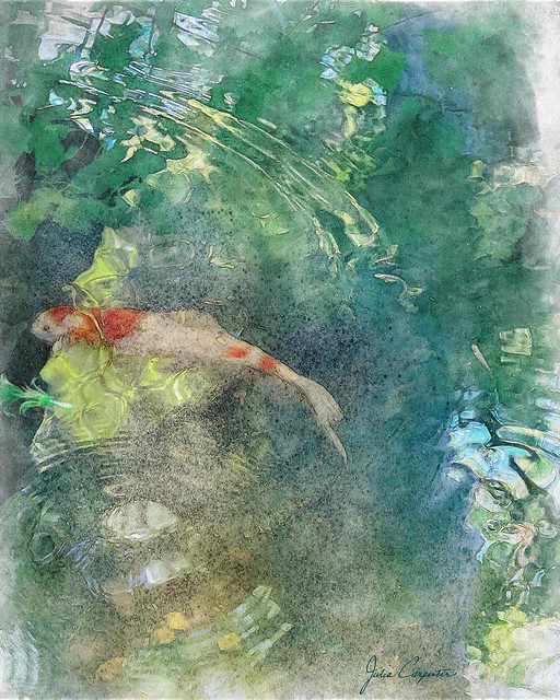
 That's what Mr. C asked me when he looked at my latest oeuvre, Gazing into the pond. Well, I was going for a watercolor-esque effect, but not actually trying to exactly simulate a watercolor. Because digital art has a legitimacy of its own. It is what it is, and mastering its tools is no different than learning to wield pencil or brush and paints skillfully and effectively.

I liked the composition of the original photo with the arc above and the circles of ripples below anchored by the fish in between. But it took color toning, assorted tweaking and, yes, the selective use of a filter, plus some over-painting to achieve the look that satisfied me. In fact, there's such an abundance of options, of ways to color and tone, to sharpen or soften, to add effects, to draw and paint, that just knowing (or deciding) when you've done enough is a skill in itself. 

Reflections of summer  

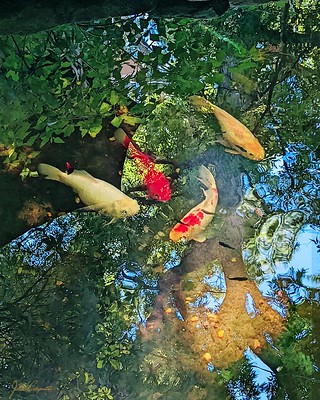
I'd earlier created a much less painterly image with a photo taken at the same time. In that I had liked the intricate detailing of the reflections in the water and chose to emphasize that, but the major noticeable difference between it and the photo is the color that was brought out. 


As you can tell from my images on Flickr, I don't have a distinctive “style.” I love the freedom that digital art offers. I open Photoshop each time with a sense of anticipation. I may have an idea of what I want, but the path to the finish always has some fortuitous surprises. And always I learn more of how to manipulate the fabulous medium of digital art.


Tuesday, June 21, 2022

A simple pleated silk lampshade

I doubt someone seeing this simple pleated silk lampshade on the crystal table lamp between my living and dining rooms would have any idea of the work that went into it. Not to mention all the approach-avoidance angst. The minute I crowned the lamp with the newly completed shade, it seemed like it had always been there. And the flaws that were so disappointing to me as it sat on my work table also seem to disappear.

The original pleated fabric shade had begun to deteriorate some time ago, so when I came upon the book Shades of Light: Making Tailored Lampshades by Ruth De Fraga Gomes, I immediately ordered it. But possessing and perusing the book is rather like buying a pattern and feeling like you nearly already have the garment from it. After my initial enthusiasm, I reasoned that I had a good many other projects demanding my attention, so perhaps I would just buy a shade. 


 You would think that a simple pleated white fabric shade would be easy to acquire, but nowhere could I find the right size and shape, except by ordering a custom shade. So, since I already had the frame, and the detailed instructions, I decided it would be me making that custom shade.

Thursday, March 31, 2022

Welcoming Spring

Back in March 2020 I snapped some pics of a swath of snowdrops. Finally this March I transformed one, using Photoshop and Topaz. Since my original photo was at most mediocre, I began by running the cropped image through Topaz Sharpen AI, but I didn't see a great deal of difference. I especially wanted to bring out the detail in the blossoms, so I used Precision Detail in Topaz Studio. Then I went to Topaz Impressions to create a painterly effect and finished with a Find Edges filter in Photoshop, toning it with a cooling Photo Filter adjustment layer. I added a white border which set off the image, but I still felt it wasn't finished.


For the final composition, I used a technique from one of my Photoshop Awake lessons. The entire image (without the Find Edges layer) was masked out and then selectively painted back in (on the mask) using watercolor brushes. Then the Find Edges layer (blend mode multiply) was put on top. Next I added some watercolor splatters around the edges. And to extend the edges of the image I cloned translucent sections onto the white border. The final touch was a soft border painted with a watercolor brush and blurred.


Snowdrops

 Working on a flower image in Photoshop is always a delight, and I did enjoy creating this.

Sunday, January 30, 2022

We continue to read...

Through the never-ending pandemic, through alarming political turmoil, through our varied personal circumstances, we continue to read. Some of us have traveled, others, including myself, have remained at home. A few no longer even live in Dallas. Most are retired or only work part time, and we have very diverse interests and pastimes. Books are what brought us together.

So, year after year, we continue to read, sharing each month a passage to another time and place. This year began in late 19th century Venice and will end in mid 20th century rural Ireland, with sojourns across the globe along the way.