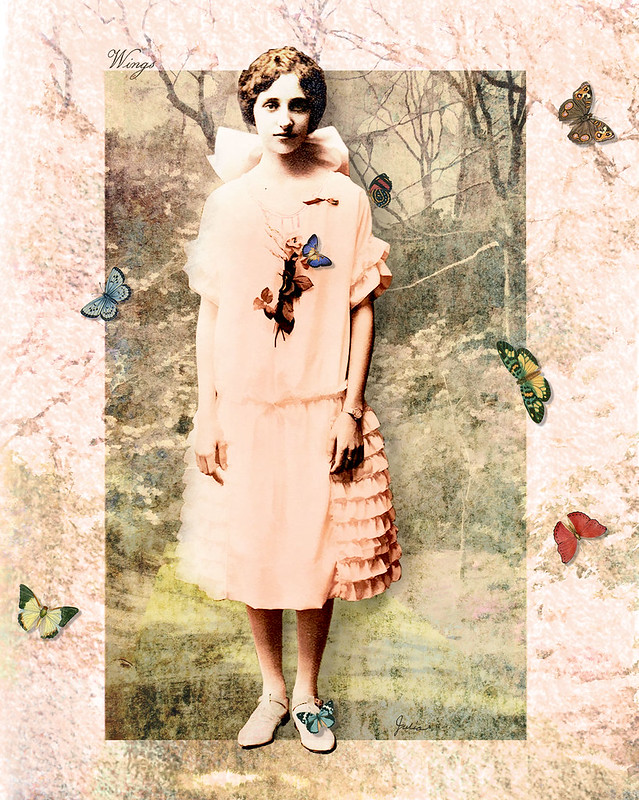
Fortunately, there aren't any topic police (and some submissions to IF have a very tenuous connection to the topic), because, as you can see, the "wings" in my illustration here are more or less gratuitous. Or perhaps merely decorative would be a kinder way to put it. I labored on a totally different concept for more than a day, finally concluding that it wasn't working and I didn't like it. This one sort of evolved, starting with the young woman who came out of a vintage photograph from The Graphics Fairy, the best site I've found for vintage graphics and illustrations. After making a composite of several layers of her, with different filters and blend modes, I started searching Lost and Taken for a textured background. At this point I was simply involved in the image that was evolving, no longer focusing on "wings," although there were a couple of random butterflies left over from my previous abandoned attempt. Then the next day I thought of adding a landscape to the background, and after much experimentation with effects, I was pleased with the result.
I couldn't let all that time and effort go to waste, could I? So I threw in a few more butterflies, with drop shadows, of course. (When in doubt, add drop shadows.) And, voilà, Wings!


i love this, beautiful collage :)
ReplyDeleteI look at your stuff to lift my spirit!
ReplyDelete