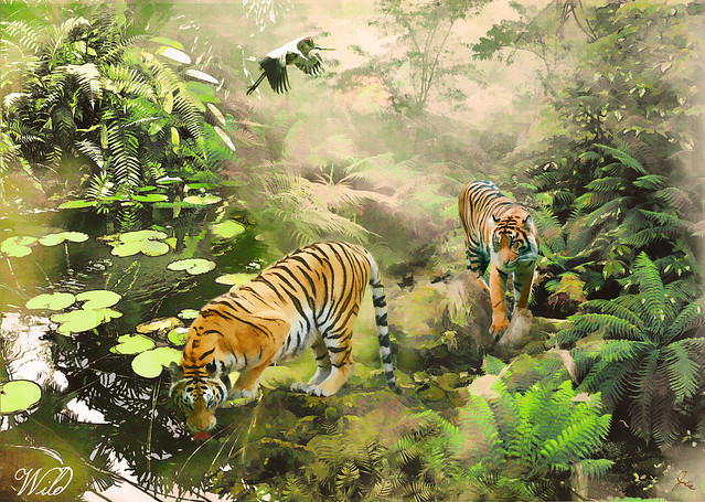
About the only thing remaining from my original concept for this topic are the tigers. I intended for it to have a stylized, naive look, à la Henri Rousseau, but instead I've ended up with this extremely layered and busy composition. Last night I was on the verge of jettisoning it, but after viewing it afresh this morning, I decided that a bit more work and some additional layers would make it acceptable to add to my Illustration Friday oeuvre.
Except for three layers of Fly Paper textures, all of the elements are from stock.xchng. The tigers and crane were removed from three separate photos. The background consists of a photo with the pond on the left and another with the rocks on the right, plus one with trees at the top. Then there are a variety of ferns from three more photos. All put together with assorted blend modes and filters and masks, in Photoshop, of course. Is it believable? Does it work? Hmmm... I always seem to end up in the "more is more" camp.

Julia, this is wonderful! I cannot fathom how many mouse clicks are included :-) Beautiful
ReplyDeleteMary, thank you so much!
Delete