
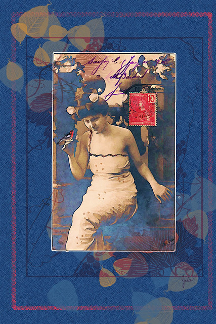
The central image came from the wondrous website of the Graphics Fairy, a veritable trove of vintage photos and art, all absolutely free. On Mondays participants can show off the many ways they have used those images in their creations, on everything from digital works like mine to pieces of furniture. Very inspirational, so be sure to take a look.
On the photo I used, the words Indochine Francaise can be seen on the postage stamp, and Saigon is the first word penned at the top. The date, 1906, can also be seen. Something about the image just appealed to me, and without any concept in mind, I chose it as my starting point. Originally I composed it for a birthday greeting; this is a slightly altered version. For those of you who may be interested in some general how-I-did-this comments, read on. For everyone else, thanks for stopping by to have a look.
I used Topaz Simplify filters on two copies of the image; on another copy I used Photoshop's Find Edges filter, and then I played around with blend modes and opacity until I arrived at the effect I liked best, no easy matter when there are so many possibilities. The original photo is nearly monochrome with the exception of the stamp and the purplish penmanship. The slightest bit of blue in the background was enhanced in the filtered images. To make the white edge around the photo, I selected the photo, then expanded the selection by a few pixels and filled a new layer under all the photo copies with white.
After that I tried out all sorts of backgrounds without success. Finally I used the Scattered Leaves brush with my colors set to blue and sepia and the Foreground-Background jitter set to 100% and the Size jitter to 50%. Because the leaves are so transparent, I copied that layer 3 more times, each layer adding a bit more color and opacity. For the background, I filled a layer with blue, added noise, then used the Crosshatch filter on it.
At this point, it was coming together but still needed more. So I added a graceful leaves and berries (or grapes) design from Japanese Patterns, an Agile Rabbit book from the Pepin Press which came with its own CD-rom. I colored the design with a Hue/Saturation Adjustment. Because I wanted the design to show inside the corners of the photo, I made another copy of the design and put it on top, added a mask which I filled with black and then painted on the mask with white to reveal just the amount of the design I wanted to show over the photo, looking as though it is showing through the photo.
For this non-birthday version, I added a border made with the Hypno Lines brush and a red sampled from the stamp. There is a mask on top of that so that the border is nearly transparent in some areas. And lastly, I added the little bird from my old Click Art collection and adjusted the color with Hue/Saturation to match the stamp. It is supposed to look a bit artificial, as though it is both in and on the photo.
I love that website! I have not done ant digital play for awhile and you have piqued my interest. Love your work.
ReplyDeleteI so appreciate your comments, Mary. My intention with my blog was to have a place to write about what I wanted and display whatever work I did, but it's nice to know that others are looking and reading.
Delete