There's a new topic every week, to interpret however you wish. And, of course, you only have a week, if you want to post and link to the site. So whenever I decide to tackle a topic, that last night before Friday brings a new one usually sees me glued to my computer screen, finishing, changing, tweaking and trying to decide on the best version of whatever I've produced. Sometimes I'm really pleased with the result; sometimes I think it's so-so, but I post it anyway, because I think that's part of the whole deal. Today I was lucky and actually finished it much earlier (although, naturally, I kept fiddling around with it).
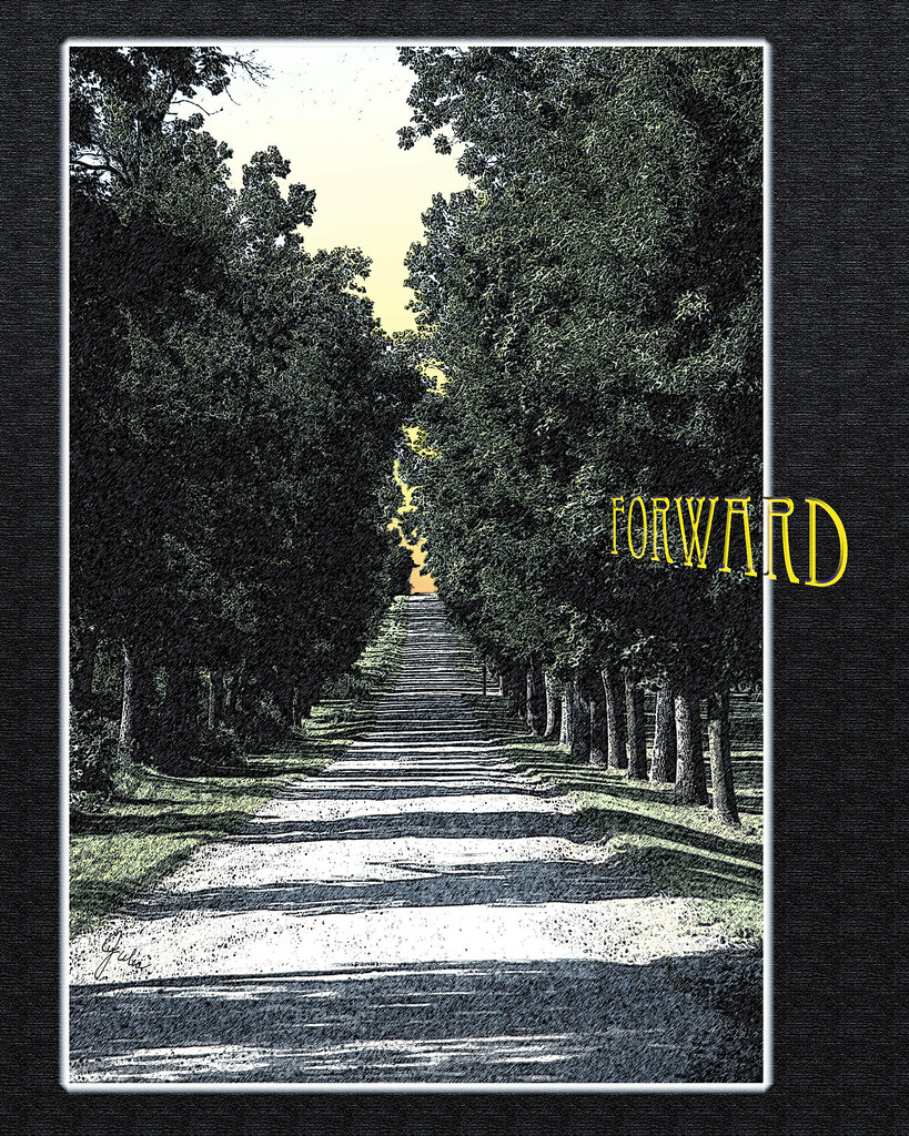
This week's topic, as you can see, is Forward. I decided from the beginning to include the topic in my compositions, as I like adding a typographical element. As with all my past Illustration Friday entries, this was done in Photoshop, basically using filters and blend modes with a bit of detailing with the brush tool. Usually I work on my own photos, but in this case I found the photo on morgueFile which is great source for free images. You can click here to see my compete Illustration Friday set on Flickr.


This illustration would be a whole lot more effective if there was, say, a hand and a finger pointing down road into the distance!!! Personally, I'd have put the hand on the right side of the illustration so that it extends out beyond the border of the image.
ReplyDeleteNow I have to take a nap. Dinner was very good!