
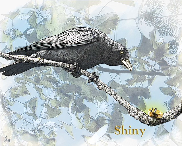
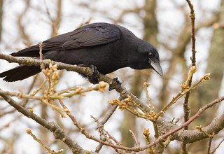
A crow peering at a shiny object seemed a natural for this week's Illustration Friday topic. I'm quite fond of crows, having had one as a pet when I was a wee girl back in Indiana. For the crow, I searched for Creative Commons images on Flickr. Wow, are there a lot of photos of crows! I'm always interested in how something is created, so I thought I'd show you the raw material, i.e. the photos, that went into this composition and explain what I did. Here is the crow photo I chose from Sean McCann's Photostream.
 First I extracted the crow and the major branch he's sitting on from the photo, then cloned out some of the small branches that overlapped the crow and the major branch. Next I filtered one copy of the crow, using Poster Edges and Film Grain filters, set to Hard Light blend mode. Using a technique from this Photoshop tutorial, I ran another copy through the Find Edges filter, then copied and filtered that copy twice again, the first and second set to Overlay blend mode, the third to Lighten. There's a Hue/Saturation adjustment layer clipped to the crow, to bring the saturation down and and remove the warm brown tone of the original photo.
After I was satisfied with the crow, I searched for a ring photo from Stock.xchng . I cut the top ring out of this photo, ran the Find Edges filter on two copies, one set to Multiply at 50% opacity, the next to Color Burn at 100% opacity, both over the top of the ring photo. And, of course, all three layers have a mask so the ring is "caught" on the little stubs of the tree branch.

 There's a blue "watercolor" background done in Painter, and then over that is my photo of ginko leaves, also filtered with Poster Edges and Film Grain. There's one copy set to Color Burn at 17% over a second copy set to Luminosity at 40%; both copies have masks that correspond to the blue watercolor layer.
 Finally I put a yellow gradiant glow on a separate layer – Color blend mode, 68% opacity – above the ring to focus attention on it. Underneath it all is a solid white layer. The title Shiny was done using the instructions for metallic type in an old Photoshop book on type effects.
Okay, if anyone who doesn't do Photoshop read all that, I'm sure you're yawning by now.
I think crows are really beautiful. They are incredibly smart too from what I hear.
ReplyDeleteThis is so great looking Julia! I have Paint Shop Pro XI but I cannot do that level of work. Your crow and background are beautiful.
ReplyDelete